nyquist
Nyquist response of dynamic system
Syntax
Description
nyquist(___) creates a Nyquist plot of the frequency
response of sys with default plotting options for all of the previous
input argument combinations. The plot displays real and imaginary parts of the system
response as a function of frequency. For more plot customization options, use nyquistplot.
To plot responses for multiple dynamic systems on the same plot, you can specify
sysas a comma-separated list of models. For example,nyquist(sys1,sys2,sys3)plots the responses for three models on the same plot.To specify a color, line style, and marker for each system in the plot, specify a
LineSpecvalue for each system. For example,nyquist(sys1,LineSpec1,sys2,LineSpec2)plots two models and specifies their plot style. For more information on specifying aLineSpecvalue, seenyquistplot.
Examples
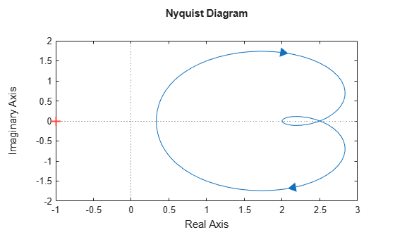
Create the following transfer function and plot its Nyquist response.
.
H = tf([2 5 1],[1 2 3]);
nyquist(H)
The nyquist function can display a grid of M-circles, which are the contours of constant closed-loop magnitude. M-circles are defined as the locus of complex numbers where the following quantity is a constant value across frequency.
.
Here, ω is the frequency in radians/TimeUnit, where TimeUnit is the system time units, and G is the collection of complex numbers that satisfy the constant magnitude requirement.
To display the grid of M-circles, right-click in the plot and select Grid. Alternatively, use the grid command.
grid on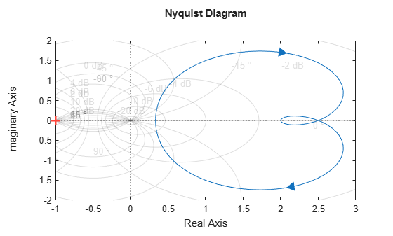
Create a Nyquist plot over a specified frequency range. Use this approach when you want to focus on the dynamics in a particular range of frequencies.
H = tf([-0.1,-2.4,-181,-1950],[1,3.3,990,2600]);
nyquist(H,{1,100})
The cell array {1,100} specifies a frequency range [1,100] for the positive frequency branch and [–100,–1] for the negative frequency branch in the Nyquist plot. The negative frequency branch is obtained by symmetry for models with real coefficients. When you provide frequency bounds in this way, the function selects intermediate points for frequency response data.
Alternatively, specify a vector of frequency points to use for evaluating and plotting the frequency response.
w = 1:0.1:30;
nyquist(H,w,'.-')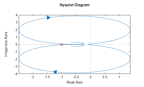
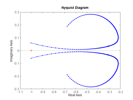
nyquist plots the frequency response at the specified frequencies.
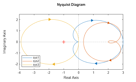
Compare the frequency response of several systems on the same Nyquist plot.
Create the dynamic systems.
rng(0)
sys1 = tf(3,[1,2,1]);
sys2 = tf([2 5 1],[1 2 3]);
sys3 = rss(4);
Create a Nyquist plot that displays all systems.
nyquist(sys1,sys2,sys3)
legend('Location','southwest')
Specify the line style, color, or marker for each system in a Nyquist plot using the LineSpec input argument.
sys1 = tf(3,[1,2,1]);
sys2 = tf([2 5 1],[1 2 3]);
nyquist(sys1,'o:',sys2,'g')
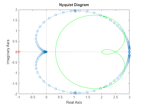
The first LineSpec, 'o:', specifies a dotted line with circle markers for the response of sys1. The second LineSpec, 'g', specifies a solid green line for the response of sys2.
Compute the real and imaginary parts of the frequency response of a SISO system.
If you do not specify frequencies, nyquist chooses frequencies based on the system dynamics and returns them in the third output argument.
H = tf([2 5 1],[1 2 3]);
[re,im,wout] = nyquist(H);
Because H is a SISO model, the first two dimensions of re and im are both 1. The third dimension is the number of frequencies in wout.
size(re)
ans = 1×3

     1     1   141
length(wout)
ans =
141
Thus, each entry along the third dimension of re gives the real part of the response at the corresponding frequency in wout.
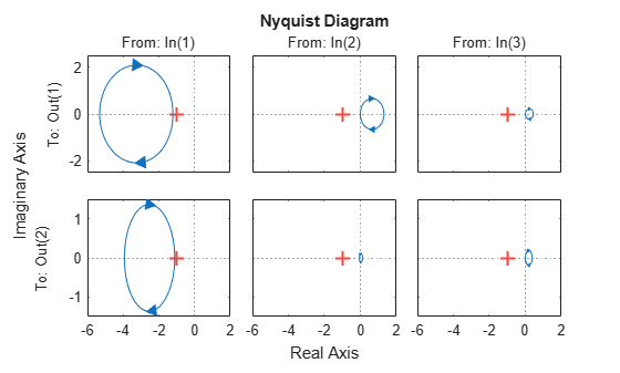
For this example, create a 2-output, 3-input system.
rng(0,'twister');
H = rss(4,2,3);
For this system, nyquist plots the frequency responses of each I/O channel in a separate plot in a single figure.
nyquist(H)
Compute the real and imaginary parts of these responses at 20 frequencies between 1 and 10 radians.
w = logspace(0,1,20);
[re,im] = nyquist(H,w);
re and im are three-dimensional arrays, in which the first two dimensions correspond to the output and input dimensions of H, and the third dimension is the number of frequencies. For instance, examine the dimensions of re.
size(re)
ans = 1×3

     2     3    20
Thus, for example, re(1,3,10) is the real part of the response from the third input to the first output, computed at the 10th frequency in w. Similarly, im(1,3,10) contains the imaginary part of the same response.
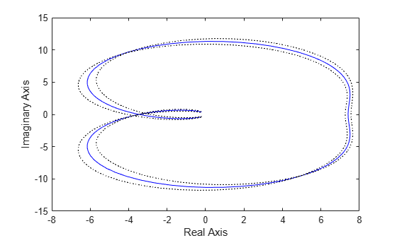
Compute the standard deviations of the real and imaginary parts of the frequency response of an identified model. Use this data to create a 3σ plot of the response uncertainty.
Load the estimation data z2.
load iddata2 z2;
Identify a transfer function model using the data. Using the tfest command requires System Identification Toolbox™ software.
sys_p = tfest(z2,2);
Obtain the standard deviations for the real and imaginary parts of the frequency response for a set of 512 frequencies, w.
w = linspace(-10*pi,10*pi,512);
[re,im,wout,sdre,sdim] = nyquist(sys_p,w);
re and im are the real and imaginary parts of the frequency response, and sdre and sdim are their standard deviations, respectively. The frequencies in wout are the same as the frequencies you specified in w.
Use the standard deviation data to create a 3σ plot corresponding to the confidence region.
re = squeeze(re);
im = squeeze(im);
sdre = squeeze(sdre);
sdim = squeeze(sdim);
plot(re,im,'b',re+3*sdre,im+3*sdim,'k:',re-3*sdre,im-3*sdim,'k:')
xlabel('Real Axis');
ylabel('Imaginary Axis');
Create a Nyquist plot of a model with complex coefficients and a model with real coefficients on the same plot.
rng(0)
A = [-3.50,-1.25-0.25i;2,0];
B = [1;0];
C = [-0.75-0.5i,0.625-0.125i];
D = 0.5;
Gc = ss(A,B,C,D);
Gr = rss(4);
nyquist(Gc,Gr)
legend('Complex-coefficient model','Real-coefficient model')
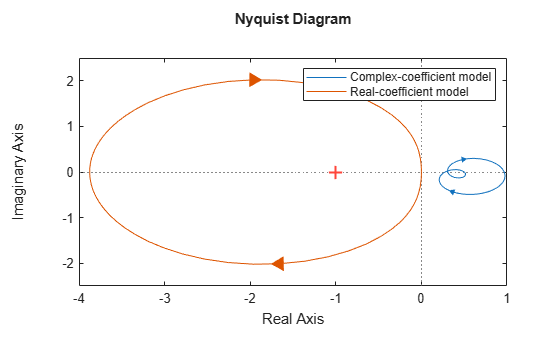
The Nyquist plot always shows two branches, one for positive frequencies and one for negative frequencies. The arrows indicate the direction of increasing frequency for each branch. For models with complex coefficients, the two branches are not symmetric. For models with real coefficients, the negative branch is obtained by symmetry.
Input Arguments
Output Arguments
Tips
Two zoom options that apply specifically to Nyquist plots are available from the right-click menu:
Full View — Clips unbounded branches of the Nyquist plot, but still includes the critical point (–1, 0).
Zoom on (-1,0) — Zooms around the critical point (–1, 0).
When you need additional plot customization options, use
nyquistplotinstead.Plots created using
nyquistdo not support multiline titles or labels specified as string arrays or cell arrays of character vectors. To specify multiline titles and labels, use a single string with anewlinecharacter.nyquist(sys,u,t) title("first line" + newline + "second line");