Create Stateflow Charts
In this tutorial, you use a Stateflow® chart to model the logic of a rechargeable battery system.
The battery system has these requirements:
The battery charges when connected to an external power source. Otherwise, it discharges.
The battery capacity charges at a rate of 4% of total charge and discharges rate of 3%.
When charging, the battery does not output power. When discharging, the battery outputs 3.5 watts of power.

To model these requirements, you build a chart that contains two
states, Charge and Discharge, that represent
the operating modes of the battery system.
Create Chart
Create a new Simulink® model that contains an empty Chart block.
Start MATLAB®. In the MATLAB Toolstrip, in the Home tab, click Simulink.
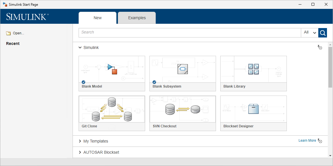
On the start page, in the Stateflow section, click the Blank Chart template.
The Simulink Editor opens and displays a model that contains a Chart block.

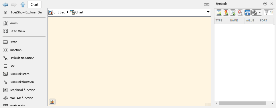
Double-click the Chart block. The Stateflow Editor opens.
The Stateflow Editor has these components:
Canvas — The graphical environment in which you place states and transitions. The canvas has a cream-colored background by default.
Explorer Bar — A rectangular area, located above the canvas, that displays the path to the open chart or graphical element. You can move between the Stateflow and Simulink Editors by clicking the arrow buttons or model elements.
Palette — A menu, located to the left of the canvas, from which you add objects to the canvas. It contains icons for states
 and other chart elements.
To display the object names, right-click the palette and click Show Names. To hide the names, right-click and select Hide Names.
Symbols pane — A pane, located to the right of the canvas by default, in which you create and manage data, events, and messages that allow the chart to communicate with the rest of the Simulink model.
To open or close the Symbols pane, in the Modeling tab, click Symbols Pane.
Add States
The battery system requires two states, one for charging and one for discharging. Use the palette to add the two states to the canvas.
In the palette, click the state icon
. To place the state, point to a blank
section of the canvas and click.
When you place a state, the editor prompts you to enter a state name in the upper-left corner of the state. Enter
Charge.To finalize the state name, click on a blank section of the canvas. To edit an existing state name, click the text inside the state.
Note
State names cannot contain spaces or begin with a number. Each state name must be unique.
Add a second state and name it
Discharge.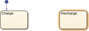
Note
State borders must not overlap.
Connect States
Transitions determine how and when your chart moves between states.
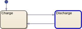
Use Default Transitions to Indicate First Active State
A blue circle ![]() indicates a default
transition, which determines which state becomes active when
the simulation starts.
indicates a default
transition, which determines which state becomes active when
the simulation starts.
The chart places a default transition on the first state you add to the
canvas. In this example, the default transition connects to the
Charge state. You can add other default transitions
from the palette by clicking the default transition icon
![]() and clicking the edge of a state.
and clicking the edge of a state.
Because the requirements state that the battery must start in the charging mode, you do not need to move the default transition.
Add Transitions Between States
Transitions between states allow the chart to move from one state to another.
To create the first transition, point to the edge of the
Chargestate until your cursor turns into a plus symbol. Click and drag to the edge of theDischargestate.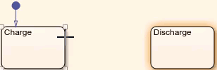
Tip
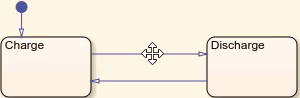
To move an existing transition, click the arrowhead and drag.
Create a transition from
DischargetoCharge.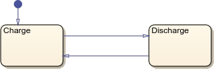
Simulate the model. In the Simulation tab, click Run.
When a state becomes active, the chart highlights the borders of the state. When the chart moves along a transition, it briefly highlights the transition. During simulation, the chart switches between the
ChargeandDischargestates at each step.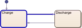
Tip
To change the animation speed, in the Debug tab, click the Animation Speed drop-down menu and select an option.
Add Transition Labels
To change the behavior of transitions, you can add transition labels. Transition labels have three optional components:
An event trigger or message trigger that prevents the chart from moving along the transition until the transition receives an event or message broadcast from another object in the chart or model.
A condition that must be met before the chart can move along the transition. To specify a condition, use square brackets.
A action that executes when the chart moves along the transition. To specify an action, use curly braces.
![]()
When you first create a transition, the Editor prompts you to enter a label. Alternatively, you can add a transition label by double-clicking the transition.
Add conditions to the transitions between the states.
To transition from
ChargetoDischargeonly when the model is not charging, double-click the transition and enter the label[~isCharging].To finalize the label, click the canvas. To move the label, click and drag.
To transition from
DischargetoChargeonly when the modeling is charging, enter the label[isCharging].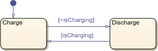
Add Executable Code
You can execute code in active states by adding state actions in the state label. State actions contain a keyword, followed by a colon and a block of executable code.
In this example, you use three types of state actions.
| State Action | Behavior |
|---|---|
entry | Executes when the state becomes active. |
during | Executes every step a state is active. Does not execute on a step when the state becomes active or becomes inactive. |
exit | Executes when the state becomes inactive. |
Add state actions that change the battery output and charge according to the operating mode.
In the
Chargestate, edit the state label by clicking the state name. Add a new line, then enter the text below. You can add new lines by pressing Enter.Theentry:sentPower=0;during:charge=charge+4;entryaction sets a variable namedsentPowerto0. Theduringaction increments a variable namedchargeby4.Tip
To manually resize a state, click any corner and drag. To automatically reformat every object on the canvas, deselect any objects by clicking a blank section of canvas. Then, press Ctrl+Shift+A.

In the
Dischargestate, add anentryaction that setssentPowerto3.5and aduringaction that decrementschargeby3.
Define Chart Data and Share with Simulink Model
When you use a variable in a transition or state, you must define the variable
as input data, output data, or
local data. In the Symbols pane,
the warning badge ![]() indicates undefined data.
indicates undefined data.
| Icon | Type | Behavior |
|---|---|---|
| Input Data | During simulation, this data receives the value of the input signal. Defining an input data adds an input port to the Chart block in Simulink. You cannot manually assign values to input data. | |
| Output Data | During simulation, the chart outputs the value of this data to Simulink. Defining an output data adds an output port to the Chart block in Simulink. | |
| Local Data | During simulation, this data stores information that is only accessible in the chart. |
The chart infers the type of each data based on context. For example, the
chart infers that isCharging is an input data,
sentPower is an output data, and
charge is a local data.
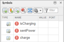
Define the type and value of the chart data.
To accept the inferred data types, in the Symbols pane, click the Resolve undefined symbols button
 . The warning badges next to the undefined data
disappear.
. The warning badges next to the undefined data
disappear.Set the initial charge of the battery. In the Symbols pane, in the
chargerow, click the Value column and enter50.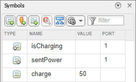
Note
During simulation, data with an undefined value defaults to
0.To return to the top level of the Simulink model, in the explorer bar, click the Up to Parent button
 .
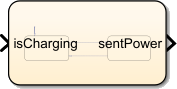
.The Chart block has an input and output port. To see the port names, expand the Chart block by clicking a corner and dragging outward.
Connect Simulink Blocks to Chart
To complete the model, connect source and sink blocks to the input and outport ports of the Chart block.
To represent the battery system that connects or disconnects from an external power source, add a Manual Switch block to the Simulink canvas. Connect the output to the input of the Chart block.
Add a Constant block with a value of
1. Connect the output to the first input port of the Manual Switch block.Add a Constant block with a value of
0. Connect the output to the second input port of the Manual Switch block.Add a Scope block. Connect the output port of the Chart block to the input port of the Scope block.
Name the Chart block
Battery.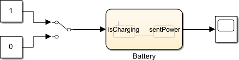
Simulate Model
Simulate the completed model.
In the Simulation tab, set Stop Time to
Inf.Double-click to enter the Chart block.
To simulate the model, in the Modeling tab, click Run. Observe the blue highlighting around the
Chargestate.Return to the Simulink Editor.
To toggle the Manual Switch block, double-click the block.
Open the Stateflow Editor. Observe the blue highlighting around the
Dischargestate.To end the simulation, in the Modeling tab, click Stop.
Toggle the Manual Switch to
1.
In the next step of the tutorial, you use active state output, logging, and breakpoints to verify and debug the battery model.