Scatter plot and linear regression
Show older comments
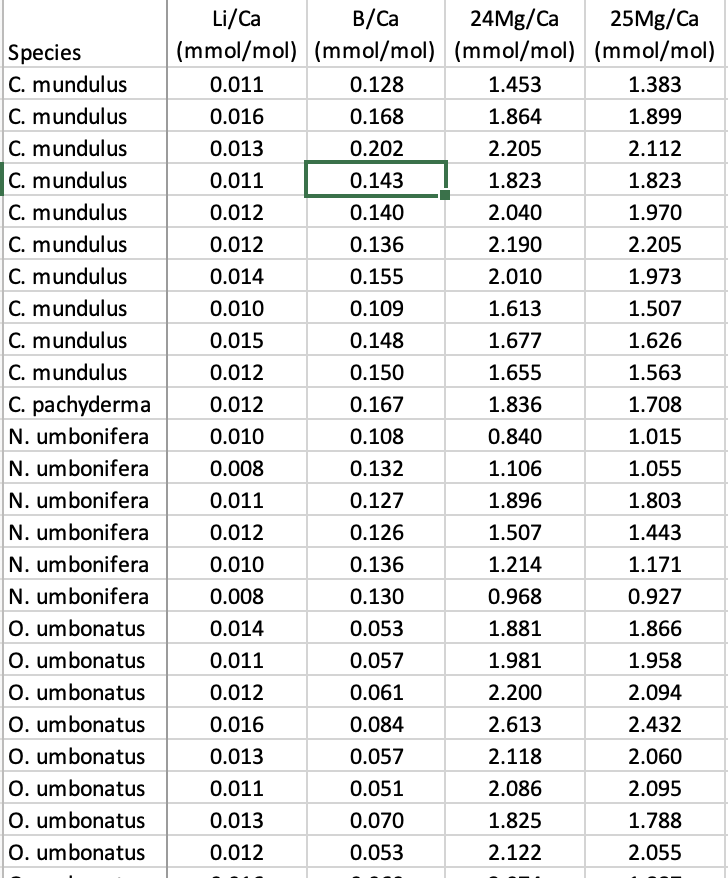
Hi! I have a data set that contains several columns the first is a categorical one with name of different species and the ogther ones are numerical values with chemical measurements for each species. I need to make a xy plot, considering the x will be the values measured for one species and y will be the values from another species. Then I need to do a linear regression to find a slope, below is a example of my data. Can someone help me?
Answers (1)
It would help to have your data and a description of what you want to plot and regress against what else.
Data = sort(rand(25, 4))+rand(1,4);
figure
hs = scatter(Data(:,1), Data(:,2:end), 'filled');
grid
hlsl = lsline;
species = ["A" "B" "C"];
for k = 1:numel(hlsl)
B(:,k) = [hlsl(k).XData; 1 1].' \ hlsl(k).YData.';
hlsl(k).Color = hs(numel(hlsl)-k+1).CData;
hlsl(k).DisplayName = "Species "+species(k);
end
legend(hlsl, 'Location','best')

This identifies each group and regression by colour. The slopes and intercepts of each regression are in the ‘B’ matrix.
.
Categories
Find more on Linear and Nonlinear Regression in Help Center and File Exchange
on 29 Apr 2024
Community Treasure Hunt
Find the treasures in MATLAB Central and discover how the community can help you!
Start Hunting!