Dashboard
In Signal Labeler, you can monitor labeling progress and inspect statistics about your labels using the Dashboard. You can display different charts to quickly determine how many members are labeled, analyze the distributions of each label, and confirm the data is labeled correctly. For an example, see Label ECG Signals and Track Progress.
In the Selected Definition section of the toolstrip, select one or
more label definitions to display from the Definition Selection
drop-down list. A separate tab for each label definition appears containing tabs for each
type of chart. The charts in the Dashboard provide:
Percentage of members labeled
Distribution of label values
Distribution of region or point instances across members
Distribution of region-of-interest (ROI) label duration values
Distribution of point label locations in time
Distribution of region or point instances across members and label values
By default, the Dashboard displays the percentage of members labeled and the label value distribution of the selected label definition. You can select additional charts from the Plots gallery based on the type of label definition selected (attribute, ROI, or point label).
Tip
To close a chart, click on the X of its tab.
To close all the charts for a label definition, right-click on the label definition name in its tab and click Close.
To change the position of charts shown for a label definition, right-click on any chart or in the label definition tab area and click
Sub-Tileto change the layout of charts toSingle,Left/Right, orTop/Bottom.
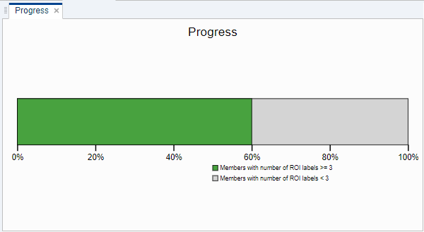
View Labeling Progress
To view your labeling progress, click Dashboard in the toolstrip. By default, the app displays the percentage of members in your data set that have at least one label for the selected label definition.
Tip
You can specify the number of ROI or point labels to count for a member in the progress bar. Click on the plot and type a new Threshold value in the toolstrip.
Inspect Label Distributions
To assess the quality and accuracy of labels in your data set, select a distribution chart from the drop-down menu in the Plots section of the toolstrip.
Label Value Distribution
You can inspect different label value distributions for attribute, ROI, or point label definitions.
Categorical, logical, or string — Each slice of the pie chart represents the number of instances of a particular label value for the selected label definition.
Numeric — Each bar in the histogram plot represents the number of instances of a particular label value for the selected label definition.
Time Distribution
You can inspect different time distributions for ROI or point label definitions.
Categorical, logical, or string — Each central mark in the box plot represents the median ROI duration or point location of a particular label value for the selected label definition. The bottom and top edges of a box indicate the 25th and 75th percentiles, respectively.
Numeric — Each bar in the histogram plot represents the number of instances of an ROI duration or a point location of a particular label value for the selected label definition.
Member Count
You can inspect the distribution of label counts simultaneously across members and across label values for ROI or point label definitions on a heatmap. The horizontal axis represents the count of region or point label instances, the left vertical axis represents the label value, and the right vertical axis represents the number of labeled members.
Categorical, logical, or string — Each section in the grid represents the count of those members that have a given number of regions or points. To adjust the number or range of horizontal bins, set the X Bins, X Min, or X Max values in the Member and Region Count section of the toolstrip.
Numeric — Each section in the grid represents the count of those members that have a given number of regions or points. You can adjust the number and range of both the horizontal and vertical bins.
Tip
Select a plot to view adjustable settings in the toolstrip.
Set the number of bins and limits along the x-axis to better inspect label distributions in a selected histogram or member count plot. You can also modify the number of bins and limits along the y-axis in a member count plot.
Plot outliers on the box plot by selecting the Show Outliers check box in the Time Distribution section.
For more information on related distribution charts, see boxplot (Statistics and Machine Learning Toolbox), heatmap, histogram, or pie.
See Also
Apps
Objects
Functions
Topics
- Label Signal Attributes, Regions of Interest, and Points
- Label ECG Signals and Track Progress
- Examine Labeled Signal Set
- Automate Signal Labeling with Custom Functions
- Label Spoken Words in Audio Signals
- Use Signal Labeler App
- Import Data into Signal Labeler
- Create or Import Signal Label Definitions
- Label Signals Interactively or Automatically
- Custom Labeling Functions
- Customize Labeling View
- Spectrogram Computation in Signal Labeler
- Export Data and Create Data Sets
- Signal Labeler Usage Tips