GridLayout
Grid layout manager UI container
Description
A grid layout manager UI container positions UI components along the rows and
columns of an invisible grid. Use the GridLayout object to modify the
appearance and behavior of a grid layout manager after you create it.
Creation
Create a grid layout manager in an app using the uigridlayout
function.
Properties
Grid
Column width, specified as a cell array containing either 'fit',
numbers, or numbers paired with 'x' characters. You can specify any
combination of values. The number of elements in the cell array controls the number of columns
in the grid. For example, to create a 4-column grid, specify a 1-by-4 cell array. Column width
can be specified as a string array or numeric array, only if the elements specified are of the
same type, like ["1x" "2x" "1x"] or [100 200 50].
There are three different types of column widths:
Fit width — Specify
'fit'. Column width automatically adjusts to fit its contents. For text-based components,'fit'width adjusts with font properties to show the whole text. For non text-based components,'fit'width is based on the default size of the component and other factors. Use'fit'width if you want to avoid hard-coding the column width to fit components, or if your app is translated to another language or runs on different platforms.Fixed width in pixels — Specify a number. The column width is fixed at the number of pixels you specify. When the parent container resizes, the column width does not change.
Variable width — Specify a number paired with an
'x'character (for example,'1x'). When the parent container resizes, the column width grows or shrinks. Variable-width columns fill the remaining horizontal space that the fixed-width columns do not use. The number you pair with the'x'character is a weight for dividing up the remaining space among all the variable-width columns. If the grid has only one variable-width column, then it uses all the remaining space regardless of the number. If there are multiple variable-width columns that use the same number, then they share the space equally. Otherwise, the amount of space is proportional to the number.
For example, {'fit',200,'2x','1x'} specifies that the width of the
first column is sized to fit its content, the second column is fixed at 200 pixels, and the
last two columns share the remaining horizontal space. The third column uses twice as much
space as the fourth column.
Changing certain aspects of a layout can affect the value of this property. For example, adding more components to a fully populated grid changes the size of the grid to accommodate the new components.
Changing the ColumnWidth property on a grid layout that already
contains components does not change the layout of the components. For example, if you try to
dynamically delete a column that contains components, the ColumnWidth
property does not change until you move those components out of that column.
Row height, specified as a cell array containing either 'fit', numbers,
or numbers paired with 'x' characters. You can specify any combination of
values. The number of elements in the cell array controls the number of rows in the grid. For
example, to create a grid that has 4 rows, specify a 1-by-4 cell array. Row height can be
specified as a string array or numeric array, only if the elements specified are of the same
type, like ["1x" "2x" "1x"] or [100 200 50].
There are three different types of row heights:
Fit height — Specify
'fit'. Row height automatically adjusts to fit its contents. For text-based components,'fit'height adjusts with font properties to show the whole text. For non text-based components,'fit'height is based on the default size of the component and other factors. Use'fit'height if you want to avoid hard-coding the row height to fit components, or if your app is translated to another language or runs on different platforms.Fixed height in pixels — Specify a number. The row height is fixed at the number of pixels you specify. When the parent container resizes, the row height does not change.
Variable height — Specify a number paired with an
'x'character (for example,'1x'). When the parent container resizes, the row grows or shrinks. Variable-height rows fill the remaining vertical space that the fixed-height rows do not use. The number you pair with the'x'character is a weight for dividing up the remaining space among all the variable-height rows. If the grid has only one variable-height row, then it uses all the remaining space regardless of the number. If there are multiple variable-height rows that use the same number, then they share the space equally. Otherwise, the amount of space is proportional to the number.
For example, {'fit',200,'2x','1x'} specifies that the height of the
first row is sized to fit its content, the second row is fixed at 200 pixels, and the last two
rows share the remaining vertical space. The third row uses twice as much space as the fourth
row.
Changing certain aspects of a layout can affect the value of this property. For example, adding more components to a fully populated grid changes the size of the grid to accommodate the new components.
Changing the RowHeight property on a grid layout that already
contains components does not change the layout of the components. For example, if you try to
dynamically delete a row that contains components, the RowHeight property
does not change until you move those components out of that row.
Column spacing, specified as a scalar number of pixels between adjacent columns in the grid. The number you specify applies to all columns.
Row spacing, specified as a scalar number of pixels between adjacent rows in the grid. The number you specify applies to all rows.
Padding around the outer perimeter of the grid, specified as a vector of the form
[left bottom right top]. The elements of the vector are described
in the table below.
| Vector Element | Description |
|---|---|
left | Distance in pixels between the inner left edge of the parent container and the left edge of the grid. |
bottom | Distance in pixels between the inner bottom edge of the parent container and the bottom edge of the grid. |
right | Distance in pixels between the inner right edge of the parent container and the right edge of the grid. |
top | Distance in pixels between the inner top edge of the parent container and the top edge of the grid. The inner top edge of the parent container starts below all decorations such as titles, tab labels, or menu bars. |
Color
Background color, specified as an RGB triplet, a hexadecimal color code, or one of the color options listed in the table.
RGB triplets and hexadecimal color codes are useful for specifying custom colors.
An RGB triplet is a three-element row vector whose elements specify the intensities of the red, green, and blue components of the color. The intensities must be in the range
[0,1]; for example,[0.4 0.6 0.7].A hexadecimal color code is a character vector or a string scalar that starts with a hash symbol (
#) followed by three or six hexadecimal digits, which can range from0toF. The values are not case sensitive. Thus, the color codes"#FF8800","#ff8800","#F80", and"#f80"are equivalent.
Alternatively, you can specify some common colors by name. This table lists the named color options, the equivalent RGB triplets, and hexadecimal color codes.
| Color Name | Short Name | RGB Triplet | Hexadecimal Color Code | Appearance |
|---|---|---|---|---|
"red" | "r" | [1 0 0] | "#FF0000" |
|
"green" | "g" | [0 1 0] | "#00FF00" |
|
"blue" | "b" | [0 0 1] | "#0000FF" |
|
"cyan"
| "c" | [0 1 1] | "#00FFFF" |
|
"magenta" | "m" | [1 0 1] | "#FF00FF" |
|
"yellow" | "y" | [1 1 0] | "#FFFF00" |
|
"black" | "k" | [0 0 0] | "#000000" |
|
"white" | "w" | [1 1 1] | "#FFFFFF" |
|
This table lists the default color palettes for plots in the light and dark themes.
| Palette | Palette Colors |
|---|---|
Before R2025a: Most plots use these colors by default. |
|
|
|
You can get the RGB triplets and hexadecimal color codes for these palettes using the orderedcolors and rgb2hex functions. For example, get the RGB triplets for the "gem" palette and convert them to hexadecimal color codes.
RGB = orderedcolors("gem");
H = rgb2hex(RGB);
Before R2023b: Get the RGB triplets using RGB =
get(groot,"FactoryAxesColorOrder").
Before R2024a: Get the hexadecimal color codes using H =
compose("#%02X%02X%02X",round(RGB*255)).
Interactivity
Visibility of children, specified as 'on' or
'off'. , or as numeric or logical 1
(true) or 0 (false). A
value of 'on' is equivalent to true, and
'off' is equivalent to false. Thus, you can
use the value of this property as a logical value. The value is stored as an on/off
logical value of type matlab.lang.OnOffSwitchState.
Set this property to 'off' to hide all child components in the
grid and their descendants. The children and their descendants are hidden regardless
of the value of their Visible properties. When components are
hidden, you can get and set their properties even though they do not appear in the
app.
When you set this property to 'on', the children and their
descendants are visible only if their Visible properties are also
set to 'on'.
Setting the Visible property on the grid does not change the
values of the Visible properties of its descendants.
Ability to scroll, specified as 'off' or
'on', or as numeric or logical 1
(true) or 0 (false). A
value of 'on' is equivalent to true, and
'off' is equivalent to false. Thus, you can
use the value of this property as a logical value. The value is stored as an on/off
logical value of type matlab.lang.OnOffSwitchState.
Setting this property to 'on' enables scrolling within the grid
layout manager. In order to scroll, these conditions must also be met:
The sum of the values specified for the
'RowHeight'property of the grid layout manager must be larger than the height of the parent container.The sum of the values specified for the
'ColumnWidth'property of the grid layout manager must be larger than the width of the parent container.At least one row or column of the grid layout manager must be set to a fixed pixel height or width.
The grid layout manager must contain components.
Certain types of charts and axes do not support scrollable containers. However, you can place the chart or axes in a nonscrollable panel, and then place the panel in the scrollable container. For more information, see Display Graphics in App Designer.
Context menu, specified as a ContextMenu object. Use this
property to display a context menu when you right-click on the grid layout manager.
Create the context menu using the uicontextmenu function.
Position
This property is read-only.
Location and size of the grid layout manager, returned as a four-element vector of the form [left bottom width height]. This table describes each element in the vector.
| Element | Description |
|---|---|
left | Distance from the inner left edge of the parent container to the left edge of the grid layout manager |
bottom | Distance from the inner bottom edge of the parent container to the bottom edge of the grid layout manager |
width | Distance between the left and right edges of the grid layout manager |
height | Distance between the bottom and top edges of the grid layout manager |
All measurements are in pixel units.
This image shows the areas defined by the Position value (orange solid
line) and the InnerPosition value (blue
dashed line) of a grid layout manager with some UI
components.

This property is read-only.
Location and size of the grid layout manager, excluding padding, returned as a
four-element vector of the form [left bottom width height]. This
table describes each element in the vector.
| Element | Description |
|---|---|
left | Distance from the inner left edge of the parent container to the inner left edge of the area of the grid layout manager into which components can be placed |
bottom | Distance from the inner bottom edge of the parent container to the inner bottom edge of the area of the grid layout manager into which components can be placed |
width | Distance between the inner left and inner right edges of the area of the grid layout manager into which components can be placed |
height | Distance between the inner bottom and inner top edges of the area of the grid layout manager into which components can be placed |
All measurements are in pixel units.
The InnerPosition value is affected by the value of the
Padding property. If Padding is [0 0
0 0], then the InnerPosition property value is
identical to the Position property value.
This image shows the areas defined by the Position value
(orange solid line) and the InnerPosition value (blue dashed line)
of a grid layout manager with some UI components.

This property is read-only.
Location and size of the grid layout manager, returned as a four-element vector of
the form [left bottom width height]. All measurements are in pixel
units.
This property value is identical to the Position property
value for grid layout managers.
Layout options, specified as a
GridLayoutOptions object. This property specifies options for a
nested grid layout container. If the grid layout is not a child of another grid layout
container (for example, it is a child of a figure or panel), then this property is
empty and has no effect. However, if the grid layout is a child of another grid
layout, you can place that child grid in the desired row and column of the parent grid
by setting the Row and Column properties on
the GridLayoutOptions object.
For example, this code nests grid2 in the third row and second
column of
grid1.
grid1 = uigridlayout([4 3]);
grid2 = uigridlayout(grid1);
grid2.Layout.Row = 3;
grid2.Layout.Column = 2;
Row or Column property as a two-element
vector. For example, this command spans grid2 over columns
2 through 3 of
grid1:grid2.Layout.Column = [2 3];
Callbacks
Object creation function, specified as one of these values:
Function handle.
Cell array in which the first element is a function handle. Subsequent elements in the cell array are the arguments to pass to the callback function.
Character vector containing a valid MATLAB® expression (not recommended). MATLAB evaluates this expression in the base workspace.
For more information about specifying a callback as a function handle, cell array, or character vector, see Callbacks in App Designer.
This property specifies a callback function to execute when MATLAB creates the object. MATLAB initializes all property values before executing the CreateFcn callback. If you do not specify the CreateFcn property, then MATLAB executes a default creation function.
Setting the CreateFcn property on an existing component has no effect.
If you specify this property as a function handle or cell array, you can access the object that is being created using the first argument of the callback function. Otherwise, use the gcbo function to access the object.
Object deletion function, specified as one of these values:
Function handle.
Cell array in which the first element is a function handle. Subsequent elements in the cell array are the arguments to pass to the callback function.
Character vector containing a valid MATLAB expression (not recommended). MATLAB evaluates this expression in the base workspace.
For more information about specifying a callback as a function handle, cell array, or character vector, see Callbacks in App Designer.
This property specifies a callback function to execute when MATLAB deletes the object. MATLAB executes the DeleteFcn callback before destroying the
properties of the object. If you do not specify the DeleteFcn
property, then MATLAB executes a default deletion function.
If you specify this property as a function handle or cell array, you can access the
object that is being deleted using the first argument of the callback function.
Otherwise, use the gcbo function to access the
object.
Callback Execution Control
Callback interruption, specified as "on" or "off", or as
numeric or logical 1 (true) or
0 (false). A value of "on"
is equivalent to true, and "off" is equivalent to
false. Thus, you can use the value of this property as a logical
value. The value is stored as an on/off logical value of type matlab.lang.OnOffSwitchState.
This property determines if a running callback can be interrupted. There are two callback states to consider:
The running callback is the currently executing callback.
The interrupting callback is a callback that tries to interrupt the running callback.
MATLAB determines callback interruption behavior whenever it executes a command that
processes the callback queue. These commands include drawnow, figure, uifigure, getframe, waitfor, and pause.
If the running callback does not contain one of these commands, then no interruption occurs. MATLAB first finishes executing the running callback, and later executes the interrupting callback.
If the running callback does contain one of these commands, then the
Interruptible property of the object that owns the running
callback determines if the interruption occurs:
If the value of
Interruptibleis set to"off", then no interruption occurs. Instead, theBusyActionproperty of the object that owns the interrupting callback determines if the interrupting callback is discarded or added to the callback queue.If the value of
Interruptibleis set to"on", then the interruption occurs. The next time MATLAB processes the callback queue, it stops the execution of the running callback and executes the interrupting callback. After the interrupting callback completes, MATLAB then resumes executing the running callback.
Note
Callback interruption and execution behave differently in these situations:
If the interrupting callback is a
DeleteFcn,CloseRequestFcn, orSizeChangedFcncallback, then the interruption occurs regardless of theInterruptibleproperty value.If the running callback is currently executing the
waitforfunction, then the interruption occurs regardless of theInterruptibleproperty value.If the interrupting callback is owned by a
Timerobject, then the callback executes according to schedule regardless of theInterruptibleproperty value.
Callback queuing, specified as "queue" or "cancel". The
BusyAction property determines how MATLAB handles the execution of interrupting callbacks. There are two callback
states to consider:
The running callback is the currently executing callback.
The interrupting callback is a callback that tries to interrupt the running callback.
The BusyAction property determines callback queuing behavior only
when both of these conditions are met:
Under these conditions, the BusyAction property of
the object that owns the interrupting callback determines how MATLAB handles the interrupting callback. Specify the
BusyAction property as one of these values:
"queue"— Put the interrupting callback in a queue to be processed after the running callback finishes execution."cancel"— Do not execute the interrupting callback.
This property is read-only.
Deletion status, returned as an on/off logical value of type matlab.lang.OnOffSwitchState.
MATLAB sets the BeingDeleted property to
'on' when the DeleteFcn callback begins
execution. The BeingDeleted property remains set to
'on' until the component object no longer exists.
Check the value of the BeingDeleted property to verify that the object is not about to be deleted before querying or modifying it.
Parent/Child
Parent container, specified as a Figure object or
one of its child containers: Tab, Panel, ButtonGroup, or
GridLayout. If no container is specified,
MATLAB calls the uifigure function to create a new Figure object that serves as the parent container.
Children, returned as an array of UI component objects. Use this property to view
the list of children or to reorder the children by setting the property to a
permutation of itself. You cannot add or remove children using this property. To add a
child to this list, set the Parent property of the child UI
component.
Reordering the children has no effect on the location of the components in the
grid. To change the location of a component in a grid, set its
Layout property.
Visibility of the object handle, specified as 'on', 'callback',
or 'off'.
This property controls the visibility of the object in its parent's
list of children. When an object is not visible in its parent's list
of children, it is not returned by functions that obtain objects by
searching the object hierarchy or querying properties. These functions
include get, findobj, clf,
and close. Objects are valid
even if they are not visible. If you can access an object, you can
set and get its properties, and pass it to any function that operates
on objects.
| HandleVisibility Value | Description |
|---|---|
'on' | The object is always visible. |
'callback' | The object is visible from within callbacks or functions invoked by callbacks, but not from within functions invoked from the command line. This option blocks access to the object at the command-line, but allows callback functions to access it. |
'off' | The object is invisible at all times. This option is useful
for preventing unintended changes to the UI by another function. Set
the HandleVisibility to 'off' to
temporarily hide the object during the execution of that function.
|
Identifiers
This property is read-only.
Type of graphics object, returned as 'uigridlayout'.
Object identifier, specified as a string scalar or character
vector. You can specify a unique Tag value to serve as an
identifier for an object. When you need access to the object elsewhere in your code, you
can use the findobj function to search for the object
based on the Tag value.
User data, specified as any MATLAB array. For example, you can specify a scalar, vector, matrix, cell array, character array, table, or structure. Use this property to store arbitrary data on an object.
If you are working in App Designer, create public or private properties in the app to share data instead of using the UserData property. For more information, see Share Data Within a Single App Designer App.
Object Functions
scroll | Scroll to location within UI component |
isInScrollView | Determine if component is visible in scrollable container |
Examples
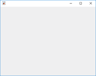
Create a figure and a grid. Then configure the grid by setting the row heights and column widths. In this case, configure a 3-by-2 grid in which the top two rows are fixed at 22 pixels, while the bottom row has a variable height. Set the left column to be 150 pixels wide, and set the right column to have a variable width. The grid fills the entire figure, but because the grid is invisible, the figure appears to be empty.
fig = uifigure('Position',[100 100 440 320]);
g = uigridlayout(fig);
g.RowHeight = {22,22,'1x'};
g.ColumnWidth = {150,'1x'};
Add two drop-downs, a list box, and an axes component to the grid. If you do not
specify row or column locations for the Layout property of
components, they populate the grid from left to right and top to bottom by default. In
this case, move the second drop-down (dd2) and the list box
(chanlist) to specific rows and columns by setting the
Layout property.
% Device drop-down
dd1 = uidropdown(g);
dd1.Items = {'Select a device'};

% Range drop-down
dd2 = uidropdown(g);
dd2.Items = {'Select a range'};
dd2.Layout.Row = 2;
dd2.Layout.Column = 1;

% List box
chanlist = uilistbox(g);
chanlist.Items = {'Channel 1','Channel 2','Channel 3'};
chanlist.Layout.Row = 3;
chanlist.Layout.Column = 1;

% Axes
ax = uiaxes(g);

Set the axes to span rows 1 through 3, filling the vertical space.
ax.Layout.Row = [1 3];

When you resize the figure, the axes grow and shrink to fill the available space
that the left column does not use. The components on the left side remain fixed because
that column is defined as 150 pixels wide.

When you assign different weights to variable-width columns, the width of each column is proportional to the weight. Variable-height rows allocate space the same way.
Create a figure and a 2-by-2 grid. Then configure the row heights and the column widths. In this case, the top row is fixed at 40 pixels, while the bottom row has a variable height. Both columns have a variable width, but the second column has twice the weight of the first column. Because the grid is invisible, the figure appears to be empty.
fig = uifigure('Position',[100 100 437 317]);
g = uigridlayout(fig,[2 2]);
g.RowHeight = {40,'1x'};
g.ColumnWidth = {'1x','2x'};

Add a label across both columns of the top row. Then add an axes component to each column of the bottom row.
% Add title
title = uilabel(g,'Text','Market Trends');
title.HorizontalAlignment = 'center';
title.FontSize = 24;
title.Layout.Row = 1;
title.Layout.Column = [1,2];

% Add two axes
ax1 = uiaxes(g);
ax2 = uiaxes(g);
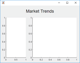
Because the left column has a weight of 1, and the right column
has a weight of 2, the axes on the right use twice as much of the
horizontal space as the axes on the left. The grid maintains this ratio when you resize
the figure.
Nested grids allow you to manage subsets of components. In this case, there are three grids: one grid that covers the entire figure, a second grid that manages a vertical stack of components, and a third grid that manages two buttons that are side by side at the bottom of the vertical stack.
Create a figure and a 1-by-2 grid. Then configure the column widths. In this case,
the left column is fixed at 150 pixels, while the right column has a
variable width. Because the grid is invisible, the figure appears to be empty.
fig = uifigure('Position',[100 100 500 315]);
grid1 = uigridlayout(fig,[1 2]);
grid1.ColumnWidth = {150,'1x'};

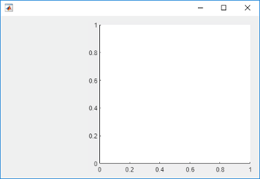
Create a 4-by-1 grid called grid2 inside the first column of
grid1. Then add an axes component to the second column of
grid1.
grid2 = uigridlayout(grid1,[4 1]);
grid2.RowHeight = {22,22,22,44};

ax = uiaxes(grid1);
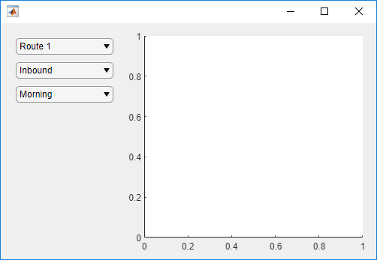
Add three drop-downs to the first three rows of grid2.
% Routes drop-down
ddRoutes = uidropdown(grid2);
ddRoutes.Items = {'Route 1', 'Route 2'};

% Direction drop-down
ddDirection = uidropdown(grid2);
ddDirection.Items = {'Inbound', 'Outbound'};

% Time drop-down
ddTime = uidropdown(grid2);
ddTime.Items = {'Morning', 'Afternoon'};
Create a 1-by-2 grid called grid3 inside the last row of
grid2. Then add two buttons to grid3. Remove the
padding on the left and right edges of grid3 so that the buttons
align with the left and right edges of the drop-downs.
grid3 = uigridlayout(grid2,[1 2]);
grid3.Padding = [0 10 0 10];
b1 = uibutton(grid3,'Text','Start');
b2 = uibutton(grid3,'Text','Stop');
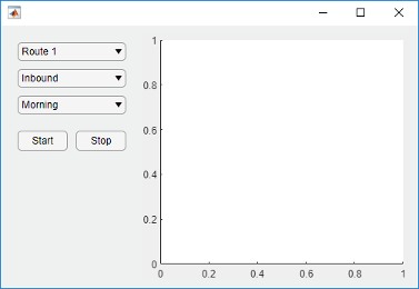
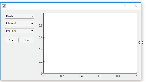
When you resize the figure, the axes grow and shrink to fill the available space
that the left column of grid1 does not use. The components on the
left side remain fixed because that column is defined as 150 pixels
wide.
Bring child components of a scrollable grid layout into view by specifying pixel coordinates or a location name.
Create a 5-by-2 grid layout and set the Scrollable property
of the grid to 'on'. Then add a label, a table, and a panel to
the grid. Set the Scrollable property of the panel to
'off' and then add a chart to the panel.
fig = uifigure('Position',[782 497 435 311]);
g = uigridlayout(fig,'Scrollable','on');
g.RowHeight = {22,40,22,22,400};
g.ColumnWidth = {400,400};

lbl = uilabel(g,'Text','Tsunamis');
lbl.Layout.Row = 2;
lbl.Layout.Column = [1,2];
lbl.HorizontalAlignment = 'center';
lbl.FontSize = 28;

tsunamis = readtable('tsunamis.xlsx');
tsunamis.Cause = categorical(tsunamis.Cause);
t = uitable(g,'Data',tsunamis);
t.Layout.Row = [3,5];
t.Layout.Column = 2;

p = uipanel(g);
p.Scrollable = 'off';
p.Layout.Row = [3,5];
p.Layout.Column = 1;
gb = geobubble(p,tsunamis.Latitude,tsunamis.Longitude,...
    tsunamis.MaxHeight,tsunamis.Cause);

Scroll to a location in the grid.
scroll(g,100,-30)
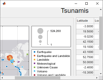
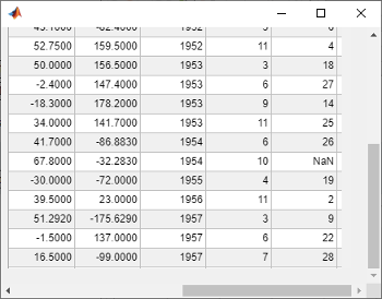
Now use location names to scroll to the bottom-right corner of the grid.
scroll(g,'bottom','right')
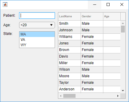
Create a grid layout manager that automatically adjusts its row and column sizes to fit components like labels as you add them to your app, or when the font size of text-based components changes dynamically.
Create a 5-by-2 grid layout manager. Specify 'fit' for the first
column width and the first four row heights.
fig = uifigure('Position',[500 500 430 310]);

g = uigridlayout(fig);
g.ColumnWidth = {'fit',120,'1x'};
g.RowHeight = {'fit','fit','fit','fit','1x'};
Create a title label that spans all the columns. Then, create labels and controls
along the rows of the first and second columns. Lastly, create a table UI component in
the last column that spans rows two through five. Notice that as you add components to
the rows and columns with 'fit' height and width, the size of those
row and columns automatically adjusts to fit the new content.
patientLabel = uilabel(g,'Text','Patient:');
patientLabel.Layout.Row = 2;
patientLabel.Layout.Column = 1;
patientEdit = uieditfield(g);

ageLabel = uilabel(g,'Text','Age:');
ageLabel.Layout.Row = 3;
ageLabel.Layout.Column = 1;
ageEdit = uidropdown(g,'Items',{'<20','20 - 40','40 - 60','>60'});

stateLabel = uilabel(g,'Text','State:');
stateLabel.VerticalAlignment = 'top';
stateLabel.Layout.Row = 4;
stateLabel.Layout.Column = 1;
stateLB = uilistbox(g,'Items',{'MA','VA','WY'});

tdata = readtable('patients.dat');
uit = uitable(g);
uit.Data = tdata;
uit.Layout.Row = [2 5];
uit.Layout.Column = 3;
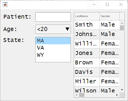
Now, change the font name and font size of all the UI components in the grid.
set(allchild(g),'FontName','Lucida Console','FontSize',20)
Version History
Introduced in R2018bUse the Position, InnerPosition, and
OuterPosition properties of a grid layout manager to access its size
and location. These properties are read-only.
Grid layout managers with row heights or column widths of 'fit' now
resize to fit the contents of table, list box, and image UI components.
In previous releases, grid layout managers with row heights or column widths of
'fit' scaled to a fixed size when the row or column contained a table,
list box, or image UI component.
Table UI component — Row height and column width previously resized to 300 pixels.
List box UI component — Row height previously resized to display at most four items. The exact pixel value to display four items might vary depending on your settings.
Image UI component — Row height and column width previously resized to 100 pixels.
To display a table, list box, or image at its size in a release before R2022a, set the
corresponding elements of the RowHeight and
ColumnWidth properties of the GridLayout object to
their respective fixed sizes.
Starting in R2020b, GridLayout objects have a
BackgroundColor property and are no longer transparent. The default
background color is the default color for all containers (for example, figures and
panels).
If your app has a grid layout in a container that has a nondefault color, then set the
BackgroundColor property of the GridLayout object
to that color to preserve the appearance of your app.
If your app has objects behind the grid that you want to remain visible, move those
objects into the grid by making them children of the GridLayout.
MATLAB Command
You clicked a link that corresponds to this MATLAB command:
Run the command by entering it in the MATLAB Command Window. Web browsers do not support MATLAB commands.
Select a Web Site
Choose a web site to get translated content where available and see local events and offers. Based on your location, we recommend that you select: .
You can also select a web site from the following list
How to Get Best Site Performance
Select the China site (in Chinese or English) for best site performance. Other MathWorks country sites are not optimized for visits from your location.
Americas
- América Latina (Español)
- Canada (English)
- United States (English)
Europe
- Belgium (English)
- Denmark (English)
- Deutschland (Deutsch)
- España (Español)
- Finland (English)
- France (Français)
- Ireland (English)
- Italia (Italiano)
- Luxembourg (English)
- Netherlands (English)
- Norway (English)
- Österreich (Deutsch)
- Portugal (English)
- Sweden (English)
- Switzerland
- United Kingdom (English)