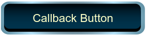
Callback Button
Libraries:
Simulink /
Dashboard /
Customizable Blocks
Description
The Callback Button block runs MATLAB® code in response to a click (immediate release of the pointer) or a press (delayed release of the pointer). You can specify different code for the click than the press. When you press the button, the code either executes after a time span or at time intervals that you specify. You can customize the appearance of the Callback Button block to look like a button in a real system. Use the Callback Button block with other dashboard blocks to create an interactive dashboard to control your model.
When a Callback Button block is active, you can interact with the gadget the block represents. Clicking an active Callback Button block pushes a virtual button. While you press your pointer, the button is pushed. When you release your pointer, you release the button. Callback Button blocks are active when the simulation is running, the block is in a panel that is open in its own window or docked and unlocked, or at least one of the callbacks triggered by a click or press has a nonempty value. To select an active Callback Button block without pushing the button, press Shift, and then click the block. To open the Block Parameters dialog box of an active Callback Button block, press Shift, and then double-click the block.
When a block is inactive, you can only interact with the block, for example, taking actions such as resizing or dragging the block. To temporarily activate an inactive Callback Button block, click the block. When you deselect the Callback Button block, the block becomes inactive again.
Specify what you want pushing the button to do using callback functions:
PressFcnfunctions run while the button is pushed. You can configure the button to run thePressFcnfunction only once while the button is pushed, or you can specify a repeat interval. To run the function only once, specify a repeat interval of0.ClickFcnfunctions run when you release the button.
You can configure the button to remain pushed when you release the pointer by setting the
Button Type to Latched. When you choose the
latched button type:
To latch the button, click the button.
To unlatch the button, click the button again.
The PressFcn function runs while the button is latched. The
ClickFcn function runs once when you latch the button and once when you
unlatch the button.
You can use states to specify how the appearance of the Callback Button block changes when you interact with the button:
While you push the button, the block is in the
Pressedstate.When the button is latched and you are not pushing it, the block is in the
Latchedstate.When the button is latched and you are pushing it, the block is in the
Latched and Pressedstate.When the block is not in any of these three states, it is in the
Defaultstate.
A state pairs pointer actions with:
A state label
A state icon
A state image
Customize Callback Button Blocks
When you add a Callback Button block to your model, the block is preconfigured with a default design. You can use the block with the default design or customize the appearance of the block.
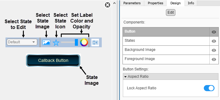
To customize the appearance of the block, use design mode. After selecting the block, you can enter design mode in one of three ways:
In the Simulink® Toolstrip, on the block-specific tab, under Design, click Edit.
In the Property Inspector, on the Design tab, click Edit.
Pause on the ellipsis that appears over the block and click the Edit Custom Block button
 .
.
In design mode, you can use the toolbar above the block to customize the callback button. To access additional customization options or to enter exact values for design settings, use the Design tab in the Property Inspector.
When you customize a Callback Button block, you configure the block
appearance for each state. When you configure the Block Type as
Momentary, the block has two states. When you configure the
Block Type as Latch, the block has four.
To select a state to customize, use the drop-down list in the toolbar. Alternatively, on
the Design tab, select the States component and
then select from the Select State list.
Design Mode Actions that Customize the Selected State
| Action | Available in Toolbar | Available in Design Tab |
|---|---|---|
Specify the state label text. | No | Yes |
Specify the color and opacity of the state label text. | Yes | Yes |
Upload a state image. | Yes | Yes |
Upload a state icon. | Yes | Yes |
Change the size of the state image and state icon. | No | Yes |
Change the position of the state label, state image, and state icon. | No | Yes |
In addition to customizing the block design using the toolbar and Design tab, you can also resize and reposition components interactively in the canvas. To resize a component specific to a state, such as the state image, select the state in the toolbar, and then resize or reposition the component.
Design Mode Actions that Apply to All States
| Action | Available in Toolbar | Available in Design Tab |
|---|---|---|
Upload a background image. | No | Yes |
Set a solid background color. | No | Yes |
Upload a foreground image. | No | Yes |
When you finish editing the design, to exit design mode, click the X in the upper right of the canvas.
Examples
Design Custom Buttons
Design buttons using the customizable Callback Button and Push Button blocks.
Parameters
Block Characteristics
Data Types | |
Direct Feedthrough |
|
Multidimensional Signals |
|
Variable-Size Signals |
|
Zero-Crossing Detection |
|
Tips
To design a button that changes the value of a variable or parameter in your model, use the Push Button block.
Extended Capabilities
Version History
Introduced in R2021bStarting in R2023b, you can open a dashboard panel in a new window. To do so, select the
panel and pause on the ellipsis that appears. In the action menu that expands, click Open In
New Window  .
.
You can minimize and restore the new window containing the panel separately from the model window. From the panel window, you can run, pause, stop, and step through the simulation. In the panel window, you can edit the panel and the blocks it contains.
To return the panel to the model canvas, in the panel window toolstrip, click Open in
canvas  .
.
For more information about opening a panel in a new window, see Open Panels in New Window.