Forecast Mortality Trends Using Lee-Carter Model
This example shows how to forecast trends in mortality using the Lee-Carter method with an ARIMA model.
The modeling of mortality and life expectancy are major research areas in life science, demography, and insurance pricing [1,2]. In the last century, because of improvements in life expectancy, financial exposures have increased for the life insurance and pension industries. In the actuarial literature, this exposure is known as longevity risk. To mitigate this risk, it is necessary to build projected life tables to predict the trend in life expectancy. Consequently, several actuarial models have been developed for better pricing of insurance premiums.
In 1992, Lee and Carter introduced the first mortality model with stochastic forecasting. The Lee-Carter (LC) model expresses the logarithm of mortality rates as the sum of age-specific mortality and time-varying parameters. The LC model is a benchmark for census bureaus and it is a leading statistical model for mortality forecasting.
This example implements the LC model and demonstrates two tools for estimating the model parameters. The example uses singular value decomposition (SVD) and univariate ARIMA to solve for and forecast the time-varying parameter.
Load and Visualize Data
Load the mortality data. This example uses United States mortality data between 1997 and 2020 from the Centers for Disease Control and Prevention (CDC). The data records the yearly mortality rate for the male, female, and combined US populations. The mortality rate is computed for one-year age groups, starting with 0–1 and ending with 99–100. There is also an additional age group, 100+, that always has a mortality rate of 1 and this is discarded from the analysis.
For visualization purposes, combine the ages into a smaller number of groups, but for the implementation of the LC algorithm, you use the one-year age categories.
load CDCLifeTables.mat
Data = USAllLifeTable;

% Compute mortality per age groups
MortalityRates = Data.Variables;
Years = Data.Properties.VariableNames;
Years = categorical(Years,Years,Ordinal=true);
Labels = {'<1','[1,5)','[5,15)','[15,25)','[25,35)','[35,55)','[55,75)','>=75'};
Labels = categorical(Labels,Labels,"Ordinal",true);
AgeLimits = [0, 1, 5, 15, 25, 35, 55, 75, 100];

% Initialize averaged mortality rate matrix
AverageMortalityRates = zeros(length(Labels), length(Years));

% Loop over each year
for i = 1:length(Years)
    % Calculate mortality rate for each age group
    for j = 2:length(AgeLimits)
        % Find rows corresponding to age group
        AgeRows = Data.Properties.RowNames((AgeLimits(j-1)+1):AgeLimits(j));

        % Calculate mortality rate
        AverageMortalityRates(j-1, i) = mean(Data{AgeRows,i});
    end
end

t = tiledlayout(2,1,'TileSpacing','compact');
nexttile
% Plot 0-1 age group over all years
plot(Years,100*AverageMortalityRates(1,:),'-*')
hold on
% Plot 25-35 age group over all years
plot(Years,100*AverageMortalityRates(5,:),'-s')
xlabel('Year')
legend({'Below 1 year','25-35 years'},'Location',"best")

nexttile
% Plot all age groups for 1997
plot(Labels,100*AverageMortalityRates(:,1),'-*')
hold on
% Plot all age groups for 2020
plot(Labels,100*AverageMortalityRates(:,24),'-s')
hold off
xlabel('Age Groups')
title(t,'US Mortality Rates (%)')
legend({'1997','2020'},'Location','best')
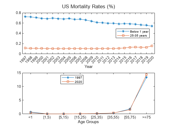
For a given age group, the trend shows that the mortality rate decreases with time because of improvements in health care, lifestyle, and so on. However, the trend slows, and even reverses, for some age groups starting around 2015. The rates are generally higher for older age groups, with an exception for infants in their first year, who have higher mortality compared to most other groups. 2020 is an unusual year, presumably due to the effects of SARS-CoV-2.
For a fixed year, 1997 or 2020, the trend shows a parabolic shape with high mortality rates for older age groups (over 75 years) and a somewhat higher mortality rates for infants in their first year.
Build Lee-Carter Model
Equation
The Lee-Carter model stipulates that the logarithm of the death rate for time t and age group x, , is the sum of three terms. The first term is an age-specific component, , which is independent of time and can be interpreted as an average age profile of mortality. The second term is the product of two components, and . is a time-dependent parameter that serves as a one-dimensional summary of the mortality rate across all age groups during year . More specifically, is the (rescaled) first principal component for the age profile of mortality at time . is an age-specific coefficient representing the sensitivity of age group to changes in . An error term is the final component in the LC model. The general equation is:
To guarantee a unique solution, the LC model adds the following two constraints on the coefficients and :
and
These two conditions are such that the coefficient is the average log mortality rate for a given age.
Interpretation
Vector is the average age profile of mortality.
Vector tracks the mortality changes over time.
Vector determines how much each age group changes when changes.
When is linear in time, each age group changes according to its specific exponential rate.
The terms on the right-hand side of equation (1) are non-observable. As such, it is not possible to perform ordinary least-squares methods to fit the model. Instead, the LC model follows a two-stage estimation approach:
Estimate the parameters using SVD.
Forecast the time series using an ARIMA model.
Estimation Using SVD
Historically, LC estimated the parameter vectors , and using US mortality data from 1933 to 1987. The estimation is based on a least-squares approach. Namely, the vector is estimated by taking the average of the log rates over time
Given equation (2.2) and the randomness of the error term , you can get an estimator for :
Using Singular Value Decomposition (SVD) on the residuals, you can solve for the parameter column vectors and . Given a time span of size T () and N age groups (), the -by- residual matrix , with age groups spanning rows and time spanning the columns, is defined as:
The values of and are known for each age group and time. You can rewrite the matrix as follows to solve for the unknowns and :
= ,
where are the singular values of in decreasing order, and and are the corresponding left and right singular vectors. The first term approximation of the SVD gives:
MATLAB® uses a LAPACK-based implementation of the SVD. With this implementation, the first singular vectors from an all-positive matrix that will always have all-negative elements. In this example, you must flip the sign for the solutions and ; otherwise, the trend is opposite to the observed and expected data [3].
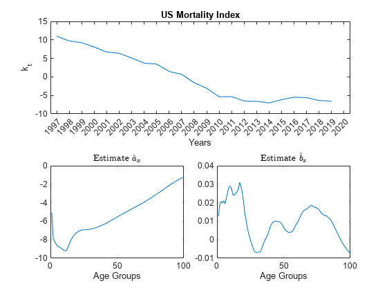
% Initialize the Mortality matrix
Mxt0 = Data.Variables;

% Remove the age group '100+', which always has a mortality rate of 1.
Mxt0 = Mxt0(1:end-1,:);

% Remove year 2020 from the time series.
Mxt0 = Mxt0(:,1:end-1);

% Define T, the number of years
T = size(Mxt0,2);

% Calculate the estimator for the age-specific pattern of mortality coefficient, a_hat
a_hat = (1/T)*sum(log(Mxt0),2); % sum(A,2) is column vector containing the sum of each row.

% Define matrix Z
Z = log(Mxt0)-a_hat;

% Apply SVD to Z
[U,S,V] = svd(Z);

% Solve for estimates b_hat and k_hat.
b_hat = -U(:,1);
sum_b_hat = sum(b_hat);
b_hat = b_hat/sum_b_hat;
k_hat = -sum_b_hat*S(1,1)*V(:,1);

% Plot the parameters
tiledlayout(2,2,'TileSpacing','compact');
nexttile([1 2])
plot(Years(1:end-1),k_hat)
xlabel('Years')
ylabel('k_t')
title('US Mortality Index')

nexttile
plot(a_hat)
xlabel('Age Groups')
title('Estimate $$\hat{a}_x$$','Interpreter','latex')

nexttile
plot(b_hat)
xlabel('Age Groups')
title('Estimate $$\hat{b}_x$$','Interpreter','latex')
With the coefficients and fitted, you only need to forecast the mortality trend for future mortality estimates. There are several forecasting methods available. This example uses an ARIMA(p,d,q) model.
Forecast Using ARIMA Models
Motivation
Predicting mortality trends with the LC model requires forecasting over time, usually as a stochastic process. is a univariate time series, and, if the requisite assumptions are met, ARIMA(p,d,q) models are effective at forecasting such a series. The fundamental assumption of an ARIMA(p,d,q) model is that past values of a given time series contain information about the future values of the time series. More specifically, assume that the series is modeled using a combination of autoregression (AR) and moving average (MA) terms. AR terms model the linear dependency of on its past values , while MA terms model the linear dependency of on past values of a white-noise process.
ARMA models assume that the given time series is stationary, which may not be correct. When a given series is not stationary, you can difference the terms of the series and test the resulting series for stationarity, then repeat as necessary until you obtain a stationary time series. This is where the integrated (I) term of the ARIMA(p,d,q) model comes from, as a time series that has been differenced d times and is an integral of order d.
The general expression for an ARIMA(p,d,q) model is
,
where is the difference operator. Fitting an ARIMA(p,d,q) model requires determining values for p, d, and q. You can do this using the Box-Jenkins methodology (see Programmatically Select ARIMA Model for Time Series Using Box-Jenkins Methodology (Econometrics Toolbox)) as a guide:
Preliminary analysis of the time series to determine the order of integration d
Identification of the orders (p,q) using the autocorrelation function (ACF) and partial ACF (PACF) outputs
Parameter estimation using the ARIMA
estimate(Econometrics Toolbox) methodUsing the residuals of the fitted model to check the goodness of fit
Forecasting future time series values, in this case against the 2020 pandemic year
Formulation
Preliminary Analysis of
Plot , as well as and .
% Plot the mortality index first order difference.
figure
tiledlayout(3,1,'TileSpacing','compact');
nexttile
plot(k_hat)
xlabel('Years')
ylabel('k_t')
title('US Mortality Index')

% Plot the first order difference.
nexttile
k_hat_Diff = diff(k_hat);
plot(k_hat_Diff)
xlabel('Years')
ylabel('\Delta k_t')
title('US Mortality Index First Order Difference')

% Plot the second order difference.
nexttile
k_hat_Diff_2 = diff(k_hat_Diff);
plot(k_hat_Diff_2)
xlabel('Years')
ylabel('\Delta^2 k_t')
title('US Mortality Index Second Order Difference')
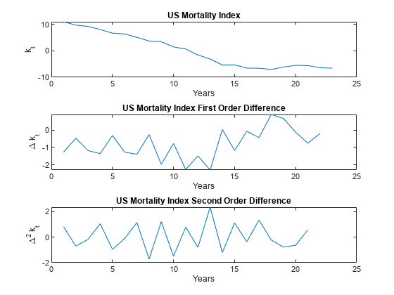
follows a linearly decreasing trend for at least part of the time series, and therefore cannot be assumed stationary. However, you can check if that the time series is trend stationary, so you can perform the Augmented Dickey-Fuller (ADF) test using adftest (Econometrics Toolbox) with the 'Model' selection set to Trend Stationary ('TS'). Test lags 0–2 because 3 and 4 are numerically difficult, and because longer lags are generally less common. Also, there are relatively few data points, implying a strong preference for a parsimonious model. Lastly, if the ADF test returns a positive result for lags 3 and 4, but not 0–2, you cannot assume trend stationarity.
adftest(k_hat,'Model','TS','Lags',[0,1,2])
ans = 1×3 logical array

   0   0   0
The ADF test results are suggestive, but often you want to confirm stationarity results using multiple test methods. A natural pairing for the ADF test is the KPSS test (kpsstest (Econometrics Toolbox)), which switches the null and alternative hypotheses. That is, with the ADF test the null hypothesis is the unit root result, and the alternative hypothesis is the stationary result. With the KPSS test the null hypothesis is the stationary result and the alternative hypothesis is the unit root.
kpsstest(k_hat,'Lags',[0,1,2])ans = 1×3 logical array
1 1 1
The KPSS test rejects the stationarity hypothesis for all lags. As expected, you cannot safely assume the raw time series is stationary or trend stationary, so you need to difference the series.
does not have an obvious trend, and therefore may be stationary. Performing an ADF test on the differenced time series, this time with 'Model' set to 'AR', shows mixed results.
adftest(k_hat_Diff,'Model','AR','Lags',[0,1,2])
ans = 1×3 logical array
1 0 0
With a lag of 0, the ADF test rejects the unit root null hypothesis. However, the ADF test fails to reject the unit root for lags of 1 and 2 (and as demonstrated later, the second order differences do have statistically significant lags). Cross-check the results against the KPSS test.
kpsstest(k_hat_Diff,'Lags',[0,1,2])ans = 1×3 logical array
1 1 0
The KPSS test rejects the stationary hypothesis for a lag of 0. The differenced time series might be stationary, but you cannot assume this. Therefore, you must difference the series once more.
Performing the ADF test on the second order time series shows that the series is likely stationary under a model with any of the three lag inputs:
adftest(k_hat_Diff_2,'Model','AR','Lags',[0,1,2])
ans = 1×3 logical array

   1   1   1
Cross-check against the KPSS test:
kpsstest(k_hat_Diff_2,'Lags',[0,1,2])ans = 1×3 logical array
0 0 0
The unit root hypothesis is rejected and the stationary hypothesis is not rejected across all lags. Thus, you can confidently fit an ARMA(p,q) model on the second order differences. Equivalently, the ARIMA(p,d,q) model has d = 2.
Identification of the Orders (p,q)
To find the orders of p and q for the ARMA model, you must continue on with the Box-Jenkins methodology (see Programmatically Select ARIMA Model for Time Series Using Box-Jenkins Methodology (Econometrics Toolbox)) and inspect the output of the ACF and PACF methods.
The ACF output for shows a single significant lag, and, importantly, shows that the autocorrelations decline gradually:
figure
autocorr(k_hat_Diff_2)
title('Autocorrelation Function of Second Order Difference')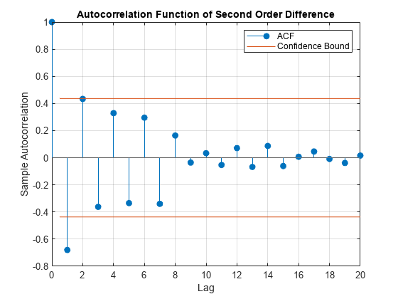
You can also inspect the PACF output:
figure
parcorr(k_hat_Diff_2,'Method','Yule-Walker')
title('Partial Autocorrelation Function of Second Order Difference')

The first partial autocorrelation is significant, after which the correlations drop off immediately. Taken together, these observations suggest an AR(1) model is appropriate where p = 1 and q = 0. A parsimonious model such as this is desirable, given the limited data.
Parameter Estimation
To estimate the model parameters, first specify the arima (Econometrics Toolbox) model that you want to use, then use estimate (Econometrics Toolbox) with the time series data as an input. You can pass estimate (Econometrics Toolbox) the original , as you set d = 2 in the model specification, and therefore estimate (Econometrics Toolbox) looks at the second-order differences.
% Create the ARIMA model
Mdl = arima(1,2,0);
Mdl = estimate(Mdl,k_hat);
    ARIMA(1,2,0) Model (Gaussian Distribution):

                 Value      StandardError    TStatistic      PValue
                ________    _____________    __________    __________

    Constant     0.04163       0.16439        0.25323         0.80009
    AR{1}       -0.71182       0.19871        -3.5822      0.00034065
    Variance     0.53307       0.19135         2.7858       0.0053396
Therefore, the model representing the mortality index is
+ .
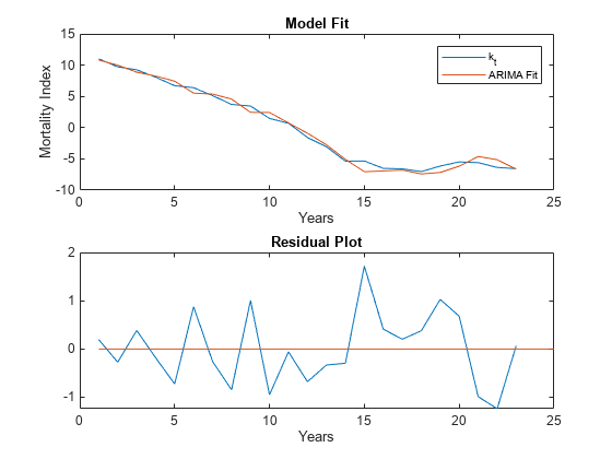
Plot the original time series with the fitted ARIMA model, as well as the residuals to further confirm that the chosen model fits the original time series.
% Compute the residuals
Res = infer(Mdl,k_hat);

% Plot time series vs ARIMA fit
figure
tiledlayout(2,1,'TileSpacing','compact');
nexttile
plot(k_hat);
hold on
% The ARIMA fit is simply the original time series minus the residuals
plot(k_hat-Res,'-')
legend({'k_t','ARIMA Fit'})
hold off
xlabel('Years')
ylabel('Mortality Index')
title('Model Fit')

nexttile
% Plot the residuals
plot(Res)
hold on
% Plot x axis (residual = 0 value)
plot([1,25],[0,0],'-')
hold off
xlabel('Years')
title('Residual Plot')
Check Goodness of Fit
Plot the standardized residuals and autocorrelations and make a QQ plot to check that the residuals.
% Plot the standardized residuals, qqplot, and correlations
figure
t = tiledlayout(2,2,'TileSpacing','compact');
nexttile
plot(Res./sqrt(Mdl.Variance))
title('Standardized Residuals')
nexttile
qqplot(Res)
nexttile
autocorr(Res)
nexttile
parcorr(Res,'Method','Yule-Walker')

% Adjust text sizes
hvec = findall(gcf,'Type','axes');
set(hvec,'TitleFontSizeMultiplier',0.8,...
    'LabelFontSizeMultiplier',0.8);

The QQ plot shows a reasonably normal distribution for the residuals. Similarly, both the ACF and PACF plots have no statistically significant correlated lags, although both outputs show a large correlation on the seventh lag that is just below significance. Overall, the residuals suggest that the fitted model is reasonable, at least given the small data set.
Another validation option is forecasting out-of-sample data points. Ideally, you would remove five data points from the end of the time series for validation purposes. However, this data set only contains 24 time periods, two of which are lost from differencing. If you removed another five, the fitted model would be based on a very small sample size. Additionally, the final year in the time series is 2020, which, due to the SARS-COV-2 pandemic, is likely to be a tail event in the mortality series. This makes 2020 a problematic year to use as an out-of-sample validation check. As such, you cannot validate this model by forecasting against validation data, and you need to take a closer look at 2020.
Model Forecast and Pandemic
You remove the year 2020 from the data set before fitting the ARIMA model, as it is likely an unusual year for mortality data. That 2020 is an outlier does not necessarily imply that the data point should be removed, however, as with a large data set outliers provide information about possible tail events. With a small data set, however, an unusual event like the SARS-CoV-2 pandemic is likely to skew the fitted parameters, and therefore you can reasonably remove 2020 from the time series. So, you have one (unusual) data point that you can forecast against. The following comparison should not be considered a form of validation, but instead it is a brief investigation into the impact that SARS-COV-2 had on annual mortality.
% Find k_hat for 2020
Y2020 = Data.Variables;
Y2020 = Y2020(:,end);

% Remove the age group '100+', which always has a mortality rate of 1.
Y2020 = Y2020(1:end-1);

% Transform Y2020
Y2020 = log(Y2020) - a_hat;

% To get the first principle component we must project our new data point
% onto the first principle direction: <v_new,v_basis>/<v_basis,v_basis>
Top = Y2020'*b_hat;
Bottom = b_hat'*b_hat;
k_hat2020 = Top/Bottom;

% Model forecast
Tf = 1;
[Y,YMSE] = forecast(Mdl,Tf,k_hat);

% Lower and upper 95% confidence bounds
YLower = Y-1.96*sqrt(YMSE);
YUpper = Y+1.96*sqrt(YMSE);

% Plot time series and forecast
figure
plot(Years(1:end-1),k_hat)
hold on
h1 = plot(Years(end-1:end),[k_hat(end);YLower],'r-.');
plot(Years(23:end),[k_hat(end);YUpper],'r-.')
h2 = plot(Years(end-1:end),[k_hat(end);Y],'k--');
h3 = plot(Years(end),k_hat2020,'bo');
hold off
xlabel('Years')
ylabel('k_t')
title('30-Year Mortality Index Forecast')
legend([h1 h2 h3],{'95% confidence interval','Forecast','2020'},'Location',"best")

The observed k_hat value for 2020 does appear to be an outlier. To understand what this actually means for mortality, you must translate this back into the multi-dimensional age profile:
% Forecasted mortality Exponent = a_hat + b_hat*Y; mxt = exp(Exponent); % Estimated mortality using the observed k_hat for 2020 Exponent2020 = a_hat + b_hat*k_hat2020; mxt2020 = exp(Exponent2020); % Adjust MinAge and MaxAge to see the predicted VS observed mortality % rates over a specific age range MinAge =20; MaxAge =
65; figure % Plot observed mortality rates plot(MinAge:MaxAge,100*MortalityRates(MinAge:MaxAge,24),'-*') hold on % Plot forecasted and estimated mortality rates plot(MinAge:MaxAge,100*mxt(MinAge:MaxAge),'k-s'); plot(MinAge:MaxAge,100*mxt2020(MinAge:MaxAge),'r-o'); hold off xlabel('Age Group') ylabel('Mortality Rate') title('US Mortality Rates (%)') legend({'2020 observed mortality rate','2020 mortality derived from forecasted k_t','2020 mortality derived from observed k_t'},'Location','best')

As expected, given the known age profile of SARS-COV-2 mortality, the pandemic appears to have had a larger impact on the elderly, relative to younger age groups. Younger age categories were also impacted, however, which can be further investigated by adjusting the slider values. Therefore, 2020 was not only an unusual year for overall mortality, but the age profile of mortality rates were also affected.
References
Haberman, S. and M. Russolillo*.* Lee-Carter Mortality Forecasting: Application to the Italian Population. Actuarial Research Paper No. 167 (London: Cass Business School, November 2005).
Chavhan R. N. and R. L. Shinde. "Modeling and Forecasting Mortality Using the Lee-Carter Model for Indian Population Based on Decade-Wise Data." Sri Lankan Journal of Applied Statistics. Vol. 17, No. 1, 2016.
Bro, R., E. Acar, and T. Kolda. Resolving the Sign Ambiguity in the Singular Value Decomposition. Sandia Report: SAND2007-6422 (United States. Dept. of Energy. Office of Scientific and Technical Information, October 2007).
See Also
lifetableconv | lifetablefit | lifetablegen