uipanel
Create panel container
Description
p = uipanel creates a panel in the current figure
and returns the Panel object. If there is no
figure available, MATLAB® calls the figure function to
create one.
p = uipanel(___,
specifies panel properties using one or more name-value arguments.
Use this option with any of the input argument combinations in the
previous syntaxes.Name,Value)
Examples
Create a panel in a UI figure.
fig = uifigure;
p = uipanel(fig);

Create a panel in a UI figure, and add a button to the panel.
fig = uifigure;
p = uipanel(fig);
btn = uibutton(p);

Create a panel in a UI figure, and customize its appearance by specifying property values.
fig = uifigure;
p = uipanel(fig, ...
    "Title","Data", ...
    "BackgroundColor","white");

Determine the panel location and size.
s = p.Position
s = 1×4

    20    20   260   221
Update the width and height of the panel by modifying the third and fourth elements of the panel Position property.
p.Position(3:4) = [150 380];

Create a panel in a UI figure. Add six UI components to the panel. The first two components are not visible because they lie outside the upper border of the panel.
fig = uifigure;
p = uipanel(fig,"Position",[20 20 196 135]);
ef1 = uieditfield(p,"Text","Position",[11 165 140 22],"Value","First Name");
ef2 = uieditfield(p,"Text","Position",[11 140 140 22],"Value","Last Name");
ef3 = uieditfield(p,"Text","Position",[11 115 140 22],"Value","Address");
dd = uidropdown(p,"Position",[11 90 140 22],"Items",["Male","Female"]);
cb = uicheckbox(p,"Position",[11 65 140 22],"Text","Member");
btn = uibutton(p,"Position",[11 40 140 22],"Text","Send");

Enable scrolling in the panel by setting the
Scrollable property to
"on". By default, the scroll
bar is scrolled to the top of the panel.
p.Scrollable = "on";

Input Arguments
Name-Value Arguments
Specify optional pairs of arguments as
Name1=Value1,...,NameN=ValueN, where Name is
the argument name and Value is the corresponding value.
Name-value arguments must appear after other arguments, but the order of the
pairs does not matter.
Example: uipanel(Title="Options") specifies that the
panel title is Options.
Before R2021a, use commas to separate each name and value, and enclose
Name in quotes.
Example: uipanel("Title","Options") specifies that
the panel title is Options.
Note
The properties listed here are a subset of the available
properties. For the full list, see Panel.
Background color, specified as an RGB triplet, a hexadecimal color code, or one of the color options listed in the table.
RGB triplets and hexadecimal color codes are useful for specifying custom colors.
An RGB triplet is a three-element row vector whose elements specify the intensities of the red, green, and blue components of the color. The intensities must be in the range
[0,1]; for example,[0.4 0.6 0.7].A hexadecimal color code is a character vector or a string scalar that starts with a hash symbol (
#) followed by three or six hexadecimal digits, which can range from0toF. The values are not case sensitive. Thus, the color codes"#FF8800","#ff8800","#F80", and"#f80"are equivalent.
Alternatively, you can specify some common colors by name. This table lists the named color options, the equivalent RGB triplets, and hexadecimal color codes.
| Color Name | Short Name | RGB Triplet | Hexadecimal Color Code | Appearance |
|---|---|---|---|---|
"red" | "r" | [1 0 0] | "#FF0000" |
|
"green" | "g" | [0 1 0] | "#00FF00" |
|
"blue" | "b" | [0 0 1] | "#0000FF" |
|
"cyan"
| "c" | [0 1 1] | "#00FFFF" |
|
"magenta" | "m" | [1 0 1] | "#FF00FF" |
|
"yellow" | "y" | [1 1 0] | "#FFFF00" |
|
"black" | "k" | [0 0 0] | "#000000" |
|
"white" | "w" | [1 1 1] | "#FFFFFF" |
|
This table lists the default color palettes for plots in the light and dark themes.
| Palette | Palette Colors |
|---|---|
Before R2025a: Most plots use these colors by default. |
|
|
|
You can get the RGB triplets and hexadecimal color codes for these palettes using the orderedcolors and rgb2hex functions. For example, get the RGB triplets for the "gem" palette and convert them to hexadecimal color codes.
RGB = orderedcolors("gem");
H = rgb2hex(RGB);
Before R2023b: Get the RGB triplets using RGB =
get(groot,"FactoryAxesColorOrder").
Before R2024a: Get the hexadecimal color codes using H =
compose("#%02X%02X%02X",round(RGB*255)).
Units of measurement, specified as one of the values in this table.
| Units Value | Description |
|---|---|
'pixels' (default in uifigure-based apps) | On Windows® and Macintosh systems, the size of a pixel is 1/96th of an inch. This size is independent of your system resolution. On Linux® systems, the size of a pixel is determined by your system resolution. |
'normalized' (default in figure-based apps) | These units are normalized with respect to the parent container. The lower-left corner of the container maps to |
'inches' | Inches. |
'centimeters' | Centimeters. |
'points' | Points. One point equals 1/72nd of an inch. |
'characters' | These units are based on the default uicontrol font of the graphics root object:
To access the default uicontrol font, use |
The recommended value is 'pixels', because most MATLAB app building functionality measures distances in pixels. You can create an
object that rescales based on the size of the parent container by parenting the object
to a grid layout manager created using the uigridlayout function. For more information, see Lay Out Apps Programmatically.
Tips
If you set the Visible property of a panel object to
"off", then any child objects it contains (such
as buttons, button groups, or axes) become invisible along with the parent
panel. However, the Visible
property value of each child object remains
unaffected.
Version History
Introduced before R2006aPanels created in apps created using the figure
function have an updated appearance. Because of this update, certain
title and border options have changed.
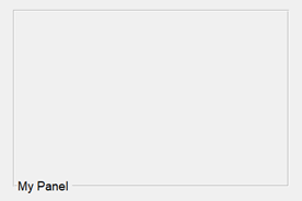
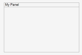
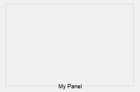
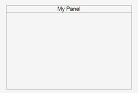
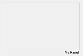
TitlePosition PropertyPanel titles can appear only at the top of panels. As a
result, these TitlePosition values have
changes in behavior.
| Value | R2024b and Earlier | Starting in R2025a | Recommended Value |
|---|---|---|---|
'leftbottom' |
|
| Update your code to use
'lefttop' instead
of'leftbottom' to reflect the
panel title position. |
'centerbottom' |
|
| Update your code to use
'centertop' instead
of'centerbottom' to reflect the
panel title position. |
'rightbottom' |
|
| Update your code to use
'righttop' instead
of'rightbottom' to reflect the
panel title position. |
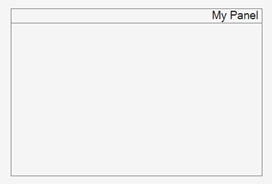
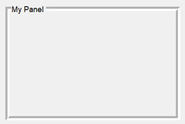
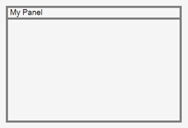
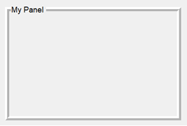
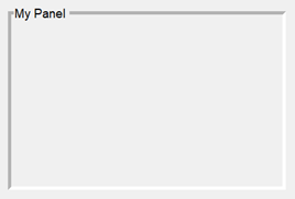
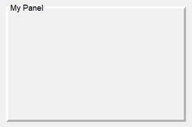
BorderType PropertyVisible panel borders always appear as a line. As a result,
some BorderType values have changes in
behavior. Specifying BorderType as any
of the values in the table causes a warning. Additionally,
the default BorderType value has
changed from 'etchedin' to
'line'.
| Value | R2024b | R2025a | Recommended Value |
|---|---|---|---|
'etchedin' |
|
| Update your code to use
'line' instead of
'etchedin' to reflect the panel
border type. |
'etchedout' |
|
| Update your code to use
'line' instead of
'etchedout' to reflect the
panel border type. |
'beveledin' |
|
| Update your code to use
'line' instead of
'beveledin' to reflect the
panel border type. |
'beveledout' |
|
| Update your code to use
'line' instead of
'beveledout' to reflect the
panel border type. |
ShadowColor PropertyAs a result of the changes to the
BorderType property, the
ShadowColor property has no
effect and warns if you set it. To specify the border color
of a panel, use the BorderColor
property instead.
The ShadowColor property no longer
appears in the list returned by calling the
get function on a
Panel object.