parallelplot
Create parallel coordinates plot
Syntax
Description
parallelplot( creates a parallel
coordinates plot from the table tbl)tbl. Each line in the plot represents
a row in the table, and each coordinate variable in the plot corresponds to a column in
the table. The software plots all table columns by default.
parallelplot(___,
specifies additional options using one or more name-value pair arguments. For example, you
can specify the data normalization method for coordinates with numeric values. For a list
of properties, see ParallelCoordinatesPlot Properties.Name,Value)
parallelplot( creates
the parallel coordinates plot in the figure, panel, or tab specified by
parent,___)parent.
p = parallelplot(___)ParallelCoordinatesPlot object. Use p to
modify the object after you create it. For a list of properties, see ParallelCoordinatesPlot Properties.
Examples
Create a parallel coordinates plot from a table of medical patient data.
Load the patients data set, and create a table from a subset of the variables loaded into the workspace. Create a parallel coordinates plot using the table. The lines in the plot correspond to individual patients. Use the plot to observe trends in the data. For example, the plot indicates that smokers tend to have higher blood pressure values (both diastolic and systolic).
load patients
tbl = table(Diastolic,Smoker,Systolic);
p = parallelplot(tbl)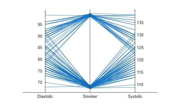
p =
  ParallelCoordinatesPlot with properties:

            SourceTable: [100×3 table]
    CoordinateVariables: {'Diastolic'  'Smoker'  'Systolic'}
          GroupVariable: ''

  Show all properties
By default, the software randomly jitters plot lines so that they are unlikely to overlap perfectly along coordinate rulers. This jittering is particularly helpful for visualizing categorical data because it enables you to distinguish between plot lines more easily. For example, observe the plot lines along the Smoker coordinate ruler; the plot lines are not flush with either the true or false tick marks.
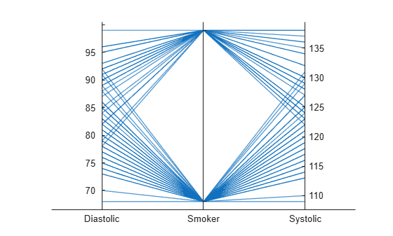
To disable the default jittering, set the Jitter property to 0.
p.Jitter = 0;
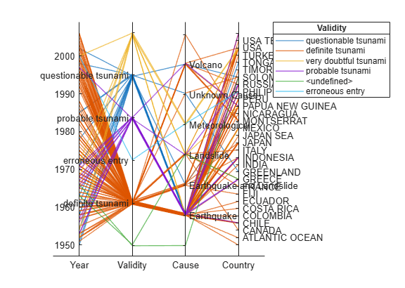
Create a parallel coordinates plot from a table of tsunami data. Specify the table variables to display and their order, and group the lines in the plot according to one of the variables.
Read the tsunami data into the workspace as a table.
tsunamis = readtable('tsunamis.xlsx');Create a parallel coordinates plot using a subset of the variables in the table. First, increase the figure window size to prevent overcrowding in the plot. Then, to specify the variables and their order, use the 'CoordinateVariables' name-value pair argument. To group occurrences according to their validity, set the 'GroupVariable' name-value pair argument to 'Validity'. The lines in the plot correspond to individual tsunami occurrences. The plot indicates that most of the occurrences in the data set that have a Validity value are considered definite tsunamis.
figure('Units','normalized','Position',[0.3 0.3 0.45 0.4])
coordvars = {'Year','Validity','Cause','Country'};
p = parallelplot(tsunamis,'CoordinateVariables',coordvars,'GroupVariable','Validity');
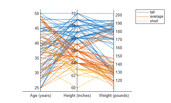
Create a parallel coordinates plot from a matrix containing medical patient data. Bin the values in one of the columns in the matrix, and group the lines in the plot using the binned values.
Load the patients data set, and create a matrix from the Age, Height, and Weight values. Create a parallel coordinates plot using the matrix data. Label the coordinate variables in the plot. The lines in the plot correspond to individual patients.
load patients
X = [Age Height Weight];
p = parallelplot(X)
p =
ParallelCoordinatesPlot with properties:
Data: [100×3 double]
CoordinateData: [1 2 3]
GroupData: []
Show all properties
p.CoordinateTickLabels = {'Age (years)','Height (inches)','Weight (pounds)'};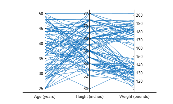
Create a new categorical variable that groups each patient into one of three categories: short, average, or tall. Set the bin edges such that they include the minimum and maximum Height values.
min(Height)
ans =
60
max(Height)
ans =
72
binEdges = [60 64 68 72];
bins = {'short','average','tall'};
groupHeight = discretize(Height,binEdges,'categorical',bins);
Now use the groupHeight values to group the lines in the parallel coordinates plot. The plot indicates that short patients tend to weigh less than tall patients.
p.GroupData = groupHeight;
Create parallel coordinates plots from a matrix containing medical patient data. For each plot, specify the columns of the matrix to display, and group the lines in the plot according to a separate variable.
Load the patients data set, and create a matrix from some of the variables loaded into the workspace.
load patients
X = [Age Height Weight];
Create a parallel coordinates plot using a subset of the columns in the matrix X. To specify the columns and their order, use the 'CoordinateData' name-value pair argument. Group patients according to their smoker status by passing the Smoker values to the 'GroupData' name-value pair argument. The lines in the plot correspond to individual patients. The plot indicates that no clear relationship exists between smoker status and either age or weight.
coorddata = [1 3];
p = parallelplot(X,'CoordinateData',coorddata,'GroupData',Smoker)
p =
  ParallelCoordinatesPlot with properties:

              Data: [100×3 double]
    CoordinateData: [1 3]
         GroupData: [100×1 logical]

  Show all properties
p.CoordinateTickLabels = {'Age','Weight'};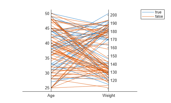
Create another parallel coordinates plot using a different subset of the columns in X. Group the patients according to their gender. The plot indicates that the men are taller and weigh more than the women.
coorddata2 = [2 3];
p2 = parallelplot(X,'CoordinateData',coorddata2,'GroupData',Gender)
p2 =
  ParallelCoordinatesPlot with properties:

              Data: [100×3 double]
    CoordinateData: [2 3]
         GroupData: {100×1 cell}

  Show all properties
p2.CoordinateTickLabels = {'Height','Weight'};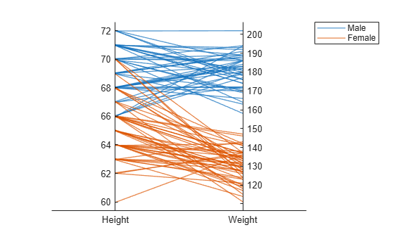
Create a parallel coordinates plot from a table of power outage data. Change the normalization method for the numeric coordinate variables.
Read the power outage data into the workspace as a table. Display the first few rows of the table.
outages = readtable('outages.csv');
head(outages)
Region OutageTime Loss Customers RestorationTime Cause
_____________ ________________ ______ __________ ________________ ___________________
{'SouthWest'} 2002-02-01 12:18 458.98 1.8202e+06 2002-02-07 16:50 {'winter storm' }
{'SouthEast'} 2003-01-23 00:49 530.14 2.1204e+05 NaT {'winter storm' }
{'SouthEast'} 2003-02-07 21:15 289.4 1.4294e+05 2003-02-17 08:14 {'winter storm' }
{'West' } 2004-04-06 05:44 434.81 3.4037e+05 2004-04-06 06:10 {'equipment fault'}
{'MidWest' } 2002-03-16 06:18 186.44 2.1275e+05 2002-03-18 23:23 {'severe storm' }
{'West' } 2003-06-18 02:49 0 0 2003-06-18 10:54 {'attack' }
{'West' } 2004-06-20 14:39 231.29 NaN 2004-06-20 19:16 {'equipment fault'}
{'West' } 2002-06-06 19:28 311.86 NaN 2002-06-07 00:51 {'equipment fault'}
Create a new variable called OutageDuration that indicates how long each power outage lasted. Convert OutageDuration to the number of days each power outage lasted. Add the new variable to the outages table, and call it OutageDays.
OutageDuration = outages.RestorationTime - outages.OutageTime;
outages.OutageDays = days(OutageDuration);
Create a parallel coordinates plot using the Loss, Customers, and OutageDays variables. Because the coordinate variables are numeric, display the values in the plot as z-scores, without any jittering, using the 'DataNormalization' and 'Jitter' name-value pair arguments.
coordvars = {'Loss','Customers','OutageDays'};
p = parallelplot(outages,'CoordinateVariables',coordvars,'DataNormalization','zscore','Jitter',0);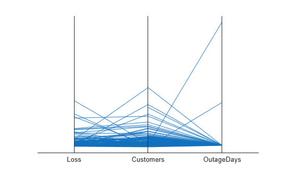
The OutageDays variable contains one value that is more than 30 standard deviations away from the mean OutageDays value and another value that is more than 10 standard deviations away from the mean. Hover over the values in the plot to display data tips. Each data tip indicates the row in the table corresponding to the line in the plot.
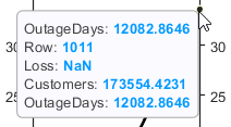
Find the rows in the outages table that have the identified extreme OutageDays values. Notice that the RestorationTime values for these two power outages are suspicious.
outliers = outages([1011 269],:)
outliers=2×7 table
       Region           OutageTime        Loss     Customers     RestorationTime            Cause            OutageDays
    _____________    ________________    ______    __________    ________________    ____________________    __________

    {'NorthEast'}    2009-08-20 02:46       NaN    1.7355e+05    2042-09-18 23:31    {'severe storm'    }       12083
    {'MidWest'  }    2008-02-07 06:18    2378.7             0    2019-08-14 16:16    {'energy emergency'}      4206.4
Create a parallel coordinates plot. Reorder the categories of one of the coordinate variables.
Read data on power outages into the workspace as a table.
outages = readtable('outages.csv');Create a parallel coordinates plot using a subset of the columns in the table. Group the lines in the plot according to the event that caused the power outage.
coordvars = [1 3 4 6];
p = parallelplot(outages,'CoordinateVariables',coordvars,'GroupVariable','Cause');
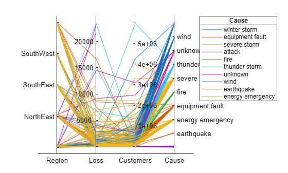
Change the order of the events in Cause by updating the source table. First, convert Cause to a categorical variable, specify the new order of the events, and use the reordercats function to create a new variable called orderCause. Then, replace the original Cause variable with the new orderCause variable in the source table of the plot.
categoricalCause = categorical(p.SourceTable.Cause);
newOrder = {'attack','earthquake','energy emergency','equipment fault', ...
    'fire','severe storm','thunder storm','wind','winter storm','unknown'};
orderCause = reordercats(categoricalCause,newOrder);
p.SourceTable.Cause = orderCause;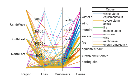
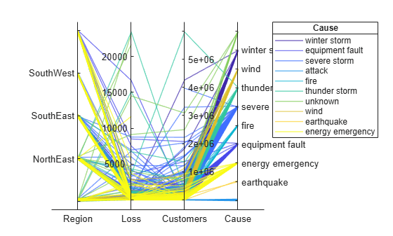
Because the Cause variable contains more than seven categories, some of the groups have the same color in the plot. Assign distinct colors to every group by changing the Color property of p.
p.Color = parula(10);
Input Arguments
Name-Value Arguments
Specify optional pairs of arguments as
Name1=Value1,...,NameN=ValueN, where Name is
the argument name and Value is the corresponding value.
Name-value arguments must appear after other arguments, but the order of the
pairs does not matter.
Before R2021a, use commas to separate each name and value, and enclose
Name in quotes.
Example: parallelplot(data,'GroupData',grpdata,'DataNormalization','zscore','Jitter',0)
specifies to group the numeric data in data by using
grpdata and to display the data as z-scores, without any
jittering.
Plot title, specified as a character vector, string array, cell array of character vectors, or categorical array. By default, the plot has no title.
To create a multiline title, specify a string array or cell array of character vectors. Each element in the array corresponds to a line of text.
If you specify the title as a categorical array, MATLAB® uses the values in the array, not the categories.
Example: p = parallelplot(__,'Title','My Title Text')
Example: p.Title = 'My Title Text'
Example: p.Title = {'My','Title'}
Normalization method for coordinates with numeric values, specified as one of the following options.
| Method | Description |
|---|---|
'range' | Display raw data along coordinate rulers that have independent minimum and maximum limits |
'none' | Display raw data along coordinate rulers that have the same minimum and maximum limits |
'zscore' | Display z-scores (with a mean of 0 and a standard deviation of 1) along each coordinate ruler |
'scale' | Display values scaled by standard deviation along each coordinate ruler |
'center' | Display data centered to have a mean of 0 along each coordinate ruler |
'norm' | Display 2-norm values along each coordinate ruler |
For more information about these methods, see normalize.
For a coordinate variable that is a logical vector, datetime array, duration array,
categorical array, string array, or cell array of character vectors,
parallelplot evenly distributes the unique possible values
along the coordinate ruler, regardless of the normalization method.
Example: p = parallelplot(__,'DataNormalization','none')
Example: p.DataNormalization = 'zscore'
Data displacement distance along the coordinate rulers, specified as a numeric scalar in the
interval [0,1]. The Jitter value determines the maximum distance to
displace plot lines from their true value along the coordinate rulers, where the
displacement is a uniform random amount. If you set the Jitter
property to 1, then adjacent jitter regions just touch. Set the
Jitter property to 0 to display the true
data values.
Some amount of jitter is particularly helpful for visualizing categorical data because the
jittering enables you to distinguish between plot lines more easily. However, the
Jitter value affects all coordinate variables, including
numeric variables.
Example: p = parallelplot(__,'Jitter',0.5)
Example: p.Jitter = 0.2
Group color, specified in one of these forms:
Character vector designating a color name, short name, or hexadecimal color code. A hexadecimal color code starts with a hash symbol (
#) and is followed by three or six hexadecimal digits, which can range from0toF. The values are not case sensitive. Thus, the color codes'#FF8800','#ff8800','#F80', and'#f80'are equivalent.String array or cell array of character vectors designating one or more color names, short names, or hexadecimal color codes.
Three-column matrix of RGB values in the range [0,1]. The three columns represent the R value, G value, and B value.
Choose among these predefined colors, their equivalent RGB triplets, and their hexadecimal color codes.
| Color Name | Short Name | RGB Triplet | Hexadecimal Color Code | Appearance |
|---|---|---|---|---|
"red" | "r" | [1 0 0] | "#FF0000" |
|
"green" | "g" | [0 1 0] | "#00FF00" |
|
"blue" | "b" | [0 0 1] | "#0000FF" |
|
"cyan"
| "c" | [0 1 1] | "#00FFFF" |
|
"magenta" | "m" | [1 0 1] | "#FF00FF" |
|
"yellow" | "y" | [1 1 0] | "#FFFF00" |
|
"black" | "k" | [0 0 0] | "#000000" |
|
"white" | "w" | [1 1 1] | "#FFFFFF" |
|
This table lists the default color palettes for plots in the light and dark themes.
| Palette | Palette Colors |
|---|---|
Before R2025a: Most plots use these colors by default. |
|
|
|
You can get the RGB triplets and hexadecimal color codes for these palettes using the orderedcolors and rgb2hex functions. For example, get the RGB triplets for the "gem" palette and convert them to hexadecimal color codes.
RGB = orderedcolors("gem");
H = rgb2hex(RGB);
Before R2023b: Get the RGB triplets using RGB =
get(groot,"FactoryAxesColorOrder").
Before R2024a: Get the hexadecimal color codes using H =
compose("#%02X%02X%02X",round(RGB*255)).
By default, parallelplot assigns a maximum of seven unique group colors. When the total number of groups exceeds the number of specified colors, parallelplot cycles through the specified colors.
Example: p = parallelplot(__,'Color',{'blue','black','green'})
Example: p.Color = [0 0 1; 0 0.5 0.5; 0.5 0.5 0.5]
Example: p.Color = {'#EDB120','#77AC30','#7E2F8E'}
Output Arguments
More About
Tips
To interactively explore the data in your
ParallelCoordinatesPlotobject, use these options (some are not available in the Live Editor):Zoom — Use the scroll wheel to zoom.
Pan — Click and drag the parallel coordinates plot to pan.
Data tips — Hover over the parallel coordinates plot to display a data tip. The software highlights the corresponding line in the plot. For an example, see Change Data Normalization in Plot.
Rearrange coordinates — Click and drag a coordinate tick label horizontally to move the corresponding coordinate ruler to a different position. For an example, see Explore Table Data Using Parallel Coordinates Plot.
If you create a parallel coordinates plot from a table, then you can customize its data tips. Data tips on parallel coordinates plots always display the value of the selected point, even if you have removed all of the rows.
To add or remove a row from the data tip, right-click anywhere on the plot and point to Modify Data Tips. Then, select or deselect a variable.
To add or remove multiple rows, right-click on the plot, point to Modify Data Tips, and select More. Then, add variables by clicking >> or remove them by clicking <<.
Version History
Introduced in R2019a