Main Content

recessionplot

Overlay recession bands on time series plot

Description

recessionplot overlays shaded US recession bands, as reported by the National Bureau of Economic Research (NBER), on a time series plot in the current axes. Abscissa data must represent dates created by datenum or datetime.

example

recessionplot(Name,Value) uses additional options specified by one or more name-value arguments. For example, recessionplot('recessions',recessionPeriods) specifies overlaying shaded bands for the recession periods in recessionPeriods.

example

hBands = recessionplot(___) returns a vector of handles to the recession bands, using any of the input-argument combinations in the previous syntaxes.

example

Examples

collapse all

Load the Data_Unemployment.mat data set, which contains a monthly US unemployment rate series measured from 1954 through 1998.

load Data_Unemployment

The variables Data and dates, among others, appear in the workspace. For more details on the data, enter Description.

Data is a 45-by-12 matrix of the unemployment rates. The rows of Data correspond to successive years and its columns correspond to successive months; Data(j,k) is the unemployment rate in month k of year j. Represent Data as a vector of regular time series data by transposing the matrix, and then vertically concatenating the columns of the result.

Data = Data';
un = Data(:);

dates is a numeric vector of the 45 consecutive sampling years. Create a datetime vector that expands dates by including all months within each year.

Y = repmat(dates',12,1);
Y = Y(:);
M = repmat((1:12)',length(dates),1);
D = ones(length(un),1);
t = datetime(Y,M,D);

Alternatively, you can use the calmonths function to efficiently include all months within each year.

tspan = datetime([dates(1); dates(end)],[1; 12],[1; 1]);
t = (tspan(1):calmonths(1):tspan(2))';

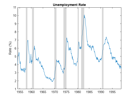
Plot the unemployment rate series. Overlay bands for recession periods reported by NBER.

plot(t,un)
recessionplot
ylabel('Rate (%)')
title("Unemployment Rate")

Figure contains an axes object. The axes object with title Unemployment Rate, ylabel Rate (%) contains 9 objects of type line, patch.

Periods of recession appear to occur with sudden, relatively large increases in the unemployment rate.

Overlay recession bands on time series plot, then return the handles of the recession bands to change the color and opacity of the bands.

Load the Data_CreditDefaults.mat data set, which contains a credit default rate series and several predictor series measured annually from 1984 through 2004.

load Data_CreditDefaults

The variables Data and dates, among others, appear in the workspace. For more details on the data, enter Description.

Data is a 21-by-5 numeric matrix containing the series. Extract the predictor series, which comprise the first four columns.

X = Data(:,1:4);

dates is a numeric vector containing the 21 sampling years. Convert dates to a datetime vector of years. Assume the series are measured at the end of the year.

T = numel(dates);
dates = [dates [12 31].*ones(T,2)];
dates = datetime(dates);

Plot the predictor series. Overlay recession bands and return the handles to the bands. Change the band color to red and reduce the opacity to 0.1.

plot(dates,X,'LineWidth',2);
xlabel("Year");
ylabel("Level");
hBands = recessionplot;
set(hBands,'FaceColor',"r",'FaceAlpha',0.1);

Figure contains an axes object. The axes object with xlabel Year, ylabel Level contains 6 objects of type line, patch.

Input Arguments

collapse all

Name-Value Arguments

Specify optional pairs of arguments as Name1=Value1,...,NameN=ValueN, where Name is the argument name and Value is the corresponding value. Name-value arguments must appear after other arguments, but the order of the pairs does not matter.

Before R2021a, use commas to separate each name and value, and enclose Name in quotes.

Example: 'recessions',recessionPeriods specifies overlaying shaded bands for the recession periods in recessionPeriods.

Axes on which to overlay recession bands, specified as an Axes object. The target axes must contain a time series plot with serial dates on the horizontal axis.

By default, recessionplot plots to the current axes (gca).

Recession periods, or data indicating the beginning and end of historical recessions, specified as a numRecessions-by-2 matrix of serial date numbers or datetime entries. Each row is a period of recession, with the first column indicating the beginning of the recession and the second column indicating the end of the recession.

The default is the US recession data in Data_Recessions.mat, reported by NBER [1].

Output Arguments

collapse all

Handles to plotted graphics objects, returned as a graphics vector. hBands contains unique plot identifiers, which you can use to query or modify properties of the recession bands.

Tips

  • recessionplot requires datetime values or serial date numbers on the horizontal axis of a time series plot. To convert other date information to this format before plotting, use datetime or datenum.

  • To achieve satisfactory displays on certain monitors and projectors, change the color and opacity of the recession bands by setting the FaceColor and FaceAlpha properties of the output handles.

References

[1] National Bureau of Economic Research (NBER), Business Cycle Expansions and Contractions, https://www.nber.org/research/data/us-business-cycle-expansions-and-contractions.
Version History

Introduced in R2012a

expand all