Create Customized ThingSpeak Channel View
This example shows how to turn the ThingSpeak™ channel view into a live data console. The example uses environmental data collected through The Things Network, but you can adapt the procedure to your own data. ThingSpeak channel 876466 is a public channel showing the data from a three-sensor probe with sensors for soil moisture, temperature, and GPS location. The example Collect Agricultural Data over The Things Network details how to build a device that posts sensor data to this channel. You can add a field value display to show a counter, and then add the channel location map. Use time-dependent reading to filter sensor data and make it easier to visualize the underlying trends. Finally, you can plot a map of the location data in the channel with colors and point areas that represent the channel data.
Add Numeric Display Widget
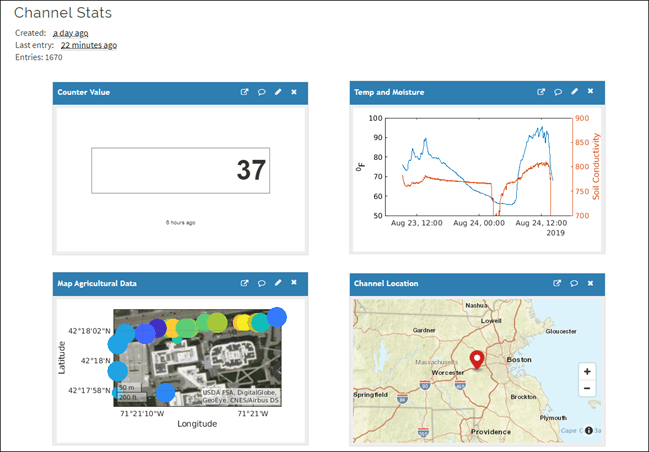
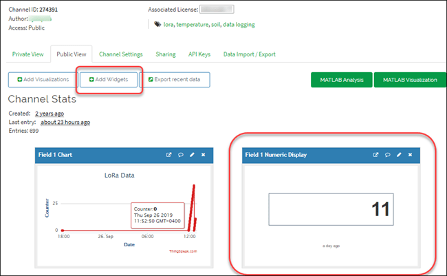
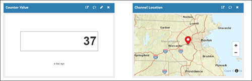
Field 1 on this channel is a counter value that demonstrates the device is live and incrementing measurements. Showing the latest value of the counter on the channel view provides a quick update on the activity of the sensor. You can add a Numeric Display Widget for your channel using the Add Widgets button in your private channel view. Note that you need data in your channel to see the field value on a numeric display widget.
Add Channel Location Map
You can store location information for a channel and for individual updates to the channel data. For this example, first add a channel location map, which is different from the feed data location information. Select the Channel Settings tab on your channel view.
![]()
Select Show Channel Location and enter the Latitude and Longitude information for your channel location.
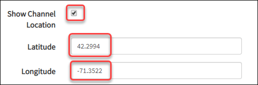
Click Save Channel to update the settings.
![]()
Now both your private and public channel views include the channel map.
Add a Two-Series Plot to Channel View
MATLAB® visualizations provide more control of the analysis and plots compared to the default ThingSpeak plots shown in your channel view. Certain license types also allow automatic updates of the visualizations. You can use both time and threshold filtering to improve the data visualization. For this example, visualize the relationship between temperature and soil moisture. Start by clicking the MATLAB Visualization button on your channel view.
Select a custom code template. Enter the code below into the MATLAB code window. Because the data of interest is from a previous experiment, use time filtering to read the older data from the channel. Set the start and end times with datetime (MATLAB). Then read the data into a timetable using thingSpeakRead.
startTime = datetime(2019,8,23,09,15,00);
endTime=  startTime+ days(2);
sensorData = thingSpeakRead(876466,'Location',1,'dateRange',[startTime endTime],...
    'location',1,'outputformat','timetable');
The temperature data in column three has some bad measurements that must be filtered out before plotting. Delete all rows where the temperature reading is larger than 100.
sensorData(sensorData{:,3}>100,:)=[];Now complete the plot. Use hold (MATLAB) to make sure the plots are in the same figure and yyaxis (MATLAB) to plot the soil moisture on the right axis. Add a ylabel (MATLAB) on each side for clarity, and set the scale with ylim (MATLAB).
plot (sensorData.Timestamps,sensorData.TemperatureF)
ylabel('^0F');
hold;
Current plot held
yyaxis right
plot(sensorData.Timestamps,sensorData.SoilMoisture);
ylabel('Soil Conductivity');
ylim([700 900]);
hold off;
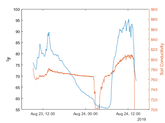
The soil moisture probe measures conductivity in the soil, so wetter, more conductive measurements have lower values on the plot. The plot shows that cooler temperatures are correlated with wetter soil.
Visualize Measurements with Location Data on the Channel View
For this channel, the prototype sends position data along with the sensor measurements. One application is to survey a large area with temperature and moisture measurements and visualize the data with location.
As in the previous example, add a new MATLAB visualization using the button on your channel view. Read the most recent points with thingSpeakRead, and plot the location data with geoscatter (MATLAB). Use geobasemap (MATLAB) to select satellite map data.
mapData = thingSpeakRead(876466,'ReadKey','R14RSDIMCQHDW1A8','Location',...
    1,'numpoints',37,'location',1,'outputformat','timetable');
geoscatter(mapData.Latitude,mapData.Longitude,'r');
geobasemap('satellite');
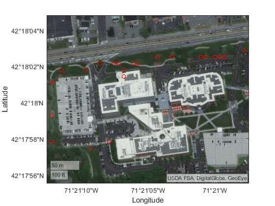
The map provides a good visualization of the positions. Include temperature and moisture data in the map to improve the visualization. When the measurement device is moved from one location to another it can make an inaccurate moisture measurement before the probe is replaced in the ground. Remove any data with values less than 500 in the soil moisture data in column two. Then rescale the data for visibility. Add the moisture data to the geoscatter (MATLAB) function to determine the size of the circles, and the temperature data to determine the color. Use the ‘filled’ option to fill the circles.
mapData(mapData{:,2}<500,:)=[];
mapData.SoilMoisture=mapData.SoilMoisture-min(mapData.SoilMoisture)+1;
geoscatter(mapData.Latitude,mapData.Longitude,mapData.SoilMoisture,mapData.TemperatureF,'filled');
geobasemap('satellite');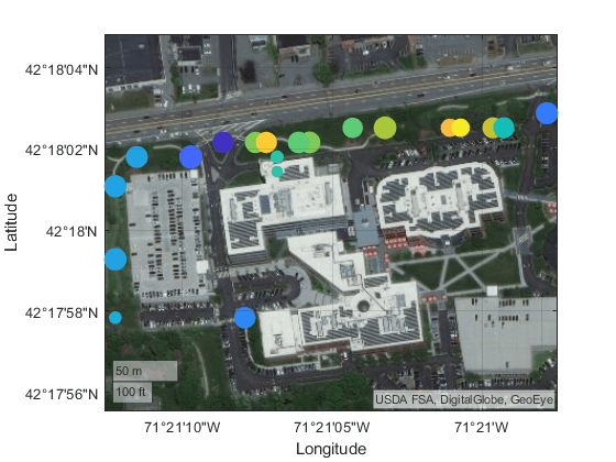
The subtle effect of warmer locations in front of the building leads to some smaller circles indicating drier soil, except on the right where the sprinklers had just finished.
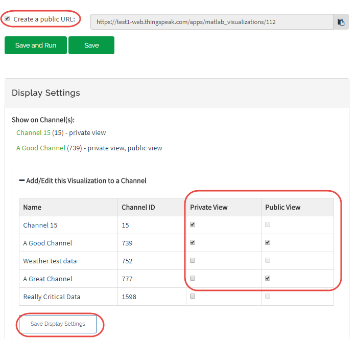
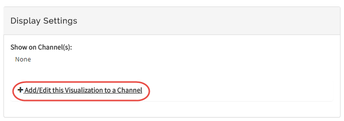
You can add saved visualizations to the public and private views of your channel. In Display Settings, use the plus sign next to Add/Edit this Visualization to a Channel to expand the channels list.
Select the check box that corresponds to the channel you want to add the visualization to. To add private visualizations, select Private View. To share the URL and add the visualization to the Public View, click Create a public URL. To update your selections, click Save Display Settings.