Create a Candle Plot with Customized Date Axis
This example shows how to generate a candle plot with a customized date axis for the end of the most recent full business day. The candle or candlestick plot indicates the sentiment of trading during several trading periods by including the open, close, high, and low prices in a dense plot.
Read Data
ThingSpeak™ channel 276806 contains delayed financial data for Google (NASDAQ: GOOGL). The data is collected once each day that the market is open. Fields 1, 2, 3, and 4 contain the last, high, and low price and volume values, respectively. Read the data using the thingSpeakRead function.
startTime = datetime('yesterday');
while( isbusday(startTime)==0)
startTime=startTime-days(1);
end
endTime = startTime+days(1);
finTable = thingSpeakRead(276806,'DateRange',[startTime endTime],'outputFormat','timetable');
Generate a Candle Plot
Use the candle function to display a candle plot for Google. Then use the dateaxis function to adjust the readability of the dates on this plot.
candle(finTable(end-20:end,:),'b');
dateaxis('x', 2);
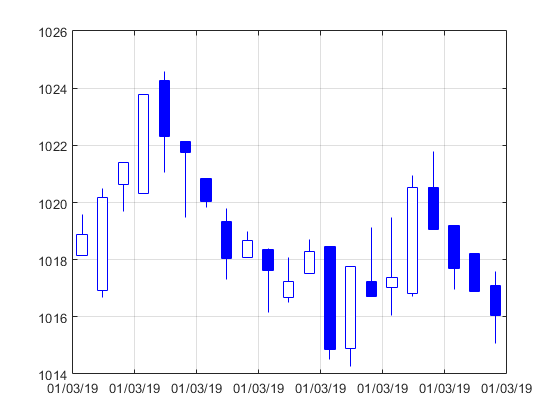
The candle plot shows a detailed summary of the recent stock behavior for Google.
See Also
Functions
thingSpeakRead|candle(Financial Toolbox) |dateaxis(Financial Toolbox) |isbusday(Financial Toolbox) |datetime(MATLAB)