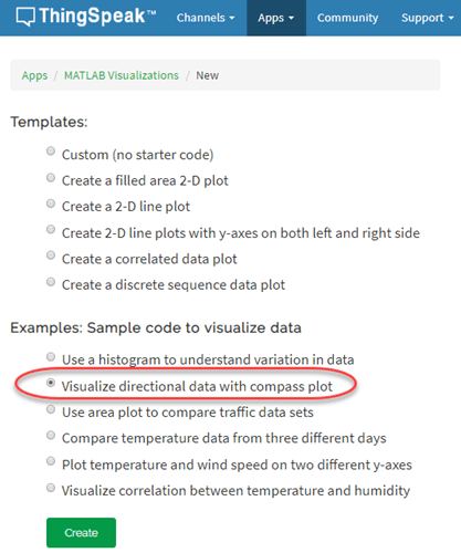
Visualize Directional Data with Compass Plot
This example demonstrates matrix calculations in MATLAB® and the use of a compass plot in a MATLAB Visualizations App to show directional distribution. In the example, as a starting point, you use one of the code templates that the MATLAB Analysis and MATLAB Visualizations apps in ThingSpeak™ provide.
ThingSpeak channel 12397 contains weather data from a weather station on top of a parking garage on the MathWorks® campus in Natick, Massachusetts. Field 1 contains the wind speed measurement.
Create a MATLAB Visualization from Template Code
To create a compass plot visualization of a set of data from a ThingSpeak channel, you can create a MATLAB script using a code template provided.
Go to the Apps tab and select MATLAB Visualizations. Click New, select Visualize directional data with compass plot, and click Create.
Visualize Your Data
ThingSpeak populates the MATLAB Code field with template code to read the data and then generate the area plot.
1) Set the variables for communicating with ThingSpeak. The weather station channel is public, so you do not need to add the read API key. If you are reading from your own channel, you can modify these values.
readChannelID = 12397;
WindDirFieldID = 1;
WindSpeedFieldID = 2;
readAPIKey = '';
2) Use thingSpeakRead to read 60 points of wind direction data from field 1. Read the wind speed data from field 2.
windDir = thingSpeakRead(readChannelID,'Fields',WindDirFieldID,'NumPoints',60,...
'ReadKey',readAPIKey);

windSpeed = thingSpeakRead(readChannelID,'Fields',WindSpeedFieldID,'NumPoints',60,...
'ReadKey',readAPIKey);
3) Convert the wind direction from degrees to radians, and shift the direction to align with north. These equations operate on each element in the array read from ThingSpeak.
rad = windDir*2*pi/360;
rad = rad+pi/2;
4) Convert the wind measurements to Cartesian coordinates for consistency with the compass (MATLAB) plot inputs. You can edit the template code to fit your application. For example, edit the code to change the number of points to read with thingSpeakRead.
u = cos(rad) .* windSpeed;
v = sin(rad) .* windSpeed;
compass(u,v);
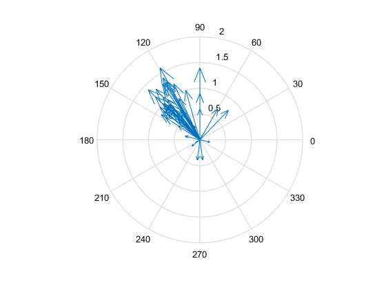
5) Press Save and Run to generate the plot. The compass plot is generated from real-time data, so your visualization is different from this plot. The plot shows the directional distribution and strength of recent wind measurements.
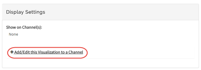
6) Optionally, you can add saved visualizations to your channel. In Display Settings, use the plus sign next to Add/Edit this Visualization to a Channel to expand the channels list.
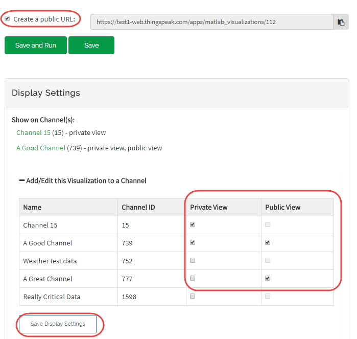
Select the check box for the channel you want to add the visualization to. To add private visualizations, select Private View. To share the URL and add the visualization to the Public View, click Create a public URL. To update your selections, click Save Display Settings.
Show Weighted Average of Wind Measurements
You can compare multiple outputs on the same plot with MATLAB Visualizations. For example, you can add an arrow indicating the weighted average direction.
1) Calculate the weighted average.
aveDir = sum(rad.*windSpeed)/sum(windSpeed);
2) Convert the measured wind directions to Cartesian coordinates. Use hold on to keep the data on the same plot, and then generate the plot. Use the line type 'ro-' to distinguish the average line from the others.
w = mean(u);
z = mean(v);

% Generate the original plot.
compass(u,v);
hold on
c = compass(w,z,'ro-');
c.LineWidth = 2;

See Also
Functions
Compass(MATLAB) |thingSpeakRead