Icon Editor
R2026bDescription
Use the Icon Editor to create and edit masked block icons in a graphical environment. You can create block icons that change when you modify the underlying block, such as by changing parameter values or resizing the block.
Using Icon Editor, you can:
Create icons visually using drawing tools, preset shapes, text, images, and alignment aids, such as grids, smart guides, and rulers.
Use Parts to render multiple variations of the same block.
Show or hide specific elements in the icon based on conditions derived from block parameters or mask parameters.
Dynamically position each element in the icon relative to the position of other elements on the canvas, or based on parameter values.
Preview the icon on the Simulink® canvas in various scenarios, such as when horizontally stretching, flipping, or scaling.
You can also create icons by using a script. In the Icon tab of the Mask Editor toolstrip, in the Authoring Mode section, click Drawing Commands. For more information, see Mask Icon Drawing Commands.
Icon Editor Panes
The Icon Editor is organized into these panes to help you design and customize icons in a graphical environment:
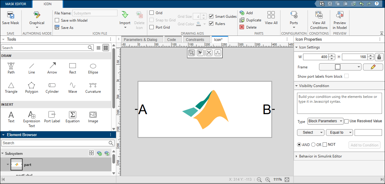
Toolstrip — Use the Icon tab of the toolstrip of Mask Editor to manage icon settings, file operations, and canvas behavior. These options let you configure how your icon is stored, displayed, and aligned within the editor.
Tools Pane — The Tools pane appears on the left side of the Icon Editor. Use the Tools pane to create custom icons by using basic shapes, paths, equations, and other tools.
Element Browser Pane — The Element Browser pane appears on the left side of the Icon Editor. Use the Element Browser pane to assign unique names to elements, hide or show them while you make modifications, lock or unlock their positions, arrange elements within groups, delete unwanted elements, and control the stack order to determine how elements overlay one another.
Canvas — Use the canvas to visually arrange and edit the graphical elements of your block icon.
Icon Properties Pane — The Icon Properties pane appears on the right side of the Icon Editor. Use the Icon Properties pane to view and edit specific attributes of an icon, such as size and visibility conditions.
Element Properties Pane — When you select an element in the canvas, the Element Properties pane appears on the right side of the Icon Editor. Use the Element Properties pane to modify the visual characteristics of the selected element, such as its format and behavior in the Simulink Editor.
Key Terminology
Here are some commonly used terms in the Icon Editor:
Element — Any single graphical object, such as a line, text, shape, or image that can be placed on the icon editor canvas.
Port — A visual reference for block input or output connections, used to align graphical elements or position text labels. Adding or removing ports in the Icon Editor does not add or remove them in a Simulink block.
Group — A collection of elements combined into a single unit you can select for easier moving, resizing, or applying shared properties.
Open the Icon Editor
To create and edit icons for masked blocks in a graphical environment:
On the Simulink canvas, right-click the block for which you want to create or edit the icon. If the block does not have a mask, select Create Mask. If a mask already exists, select Edit Mask. The Mask Editor opens.
Go to the Icon tab of the Mask Editor.
Examples
You can use the Icon Editor to define conditions to control the visibility of certain icon parts. The icon can adapt to dynamic behavior based on the block parameters.
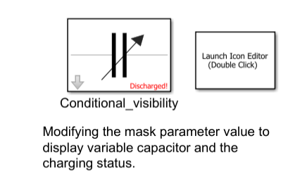
Refer to the block Conditional_visibility in the model slexMaskIconEditor. The arrow in the icon is displayed when the mask parameter Show Variable Capacitor is selected. Additionally, the block indicates its charging status as Charged or Discharged, depending on the option selected for the mask parameter Charging Status.
Control Visibility of Icon Elements Using Block Parameters
To create a visibility condition for the capacitor icon:
1. Create a mask on the Subsystem block.
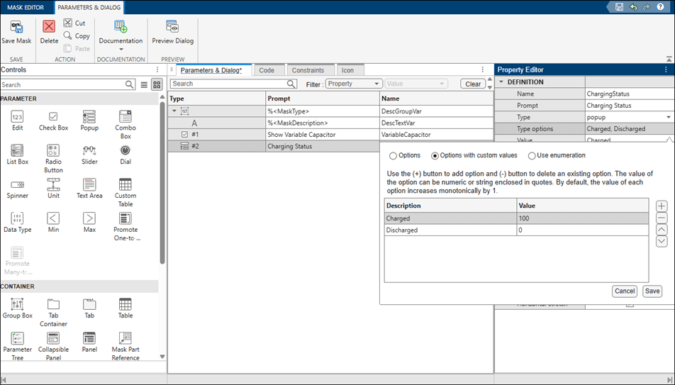
2. In the Parameters & Dialog tab of the Mask Editor, create a check box parameter named VariableCapacitor and a popup parameter named ChargingStatus. Use these mask parameters to create the visibility condition.
3. In the Icon tab, draw the capacitor icon using the available drawing tools.
4. To specify the visibility condition, select the arrow element of the icon. In the Element Properties pane, click Visibility, and then click Condition Builder. From the Condition Type list, select Block Parameters. Select the mask parameter VariableCapacitor, set the condition as Equal to, and then select on. Click Apply to create a JavaScript expression using the specified condition.
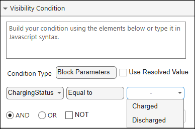
5. To display the status of the capacitor, select the text element. In the Element Properties pane, click Visibility, and then click Condition Builder. In Set Visibility Condition, specify the JavaScript expression value@ChargingStatus === 0.
6. To save the icon with the model, in the toolstrip, click Save With Model.
7. Preview the icon in Simulink canvas. Double-click the block Conditional_visibility to open the mask dialog box. Select Show Variable Capacitor and then click OK. Observe that the arrow element is visible in the icon.
Designing block icons with multiple elements can be complex. When you design block icons using parts, you can:
Break the icon into smaller sections, making it easier to manage and edit.
Reuse common elements across multiple parts to render multiple variations.
Show or hide specific sections of the icon based on block parameters.
Organize and layer elements to control which elements appear above or below others. This capability makes the stacking order clearer and reduces complexity when working with multiple elements.
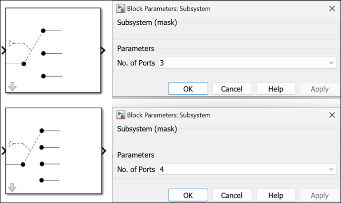
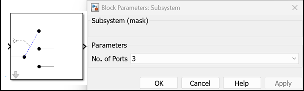
Consider a masked Subsystem block with the popup parameter set to portSelection with the prompt No.of Ports. The block icon changes based on the value you select for No. of Ports in the Block Parameters dialog box. If you specify the No. of Ports as 3, an image of a three-switch port appears on the block icon. If you specify No. of Ports as 4, an image of a four-switch port appears on the block icon.
To create block icon variations using parts:
1. Create a mask on the Subsystem block.
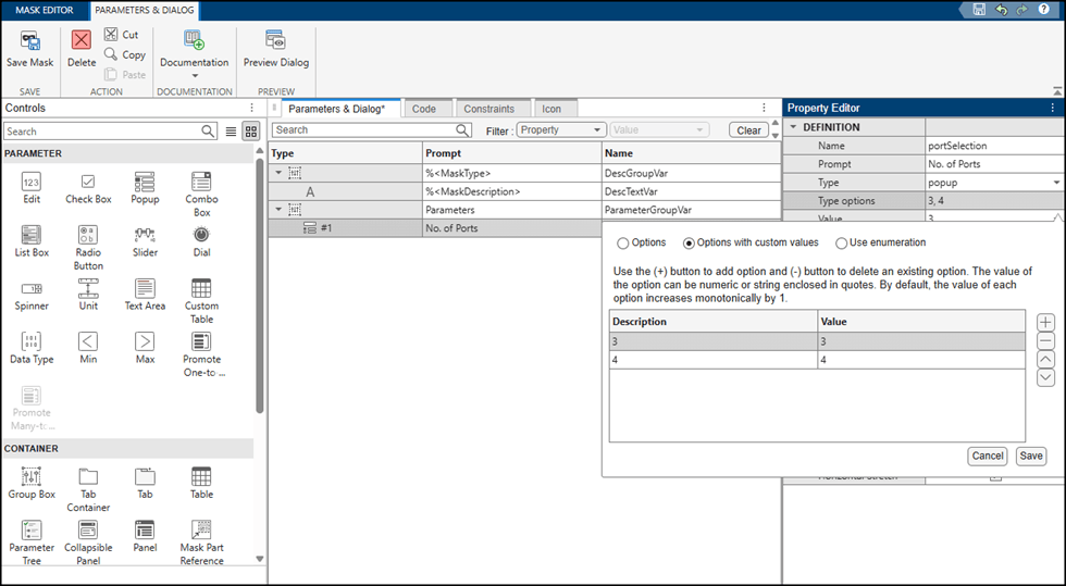
2. In the Mask Editor, in the Controls pane, click Popup to create a popup parameter. In the Property Editor pane, double-click the cell to the right of Type options and select Options with custom values. Add two rows, specify both the Description and Value for the first row as 3, and specify both the Description and Value for the second row as 4. Click Save.
3. Click the Icon tab. Draw the icon image shown.
4. Pin this part to make it the base part of the block mask icon. In the Element Browser, click the Pin icon to make this part the base part of the block mask icon. Elements in the base part appear in all other parts, so you do not need to replicate icon elements.
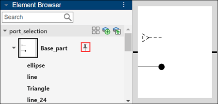
Note: You cannot modify the elements of the base part and their positions in other parts.
5. To create a new icon part, click the plus sign in the Element Browser. Use the graphical drawing tools to draw an icon with four-switch port elements. Double-click the part name to rename the part as Four_switch_port.
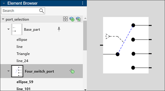
6. Click the duplicate icon part to duplicate the Four_switch_port part. Modify the duplicated part to show a three-switch port. Rename the part as Three_switch_port.
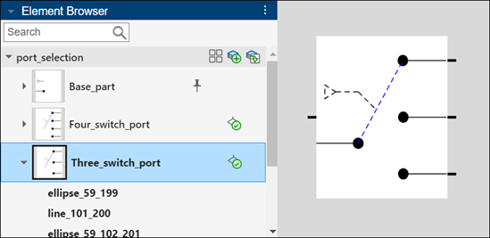
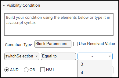
7. To control when a particular part appears as the block icon, enter conditions based on the corresponding block parameters by clicking Set visibility condition in the Element Browser. In the Element Properties pane, click Visibility, and then click Condition Builder. From the Condition Type list, select Block Parameters. Set the parameter to portSelection, the condition to Equal to, and the value to 3 for a three-switch port. Similarly, set the condition for a four-switch port, where the portSelection is equal to 4. Click Apply.
8. Save the mask. In the mask dialog box, change the value of the No. of Ports parameter. Observe how the block icon changes based on the value you select for the parameter.
Use Parts to Design Complex Block Icon and Preview Variations
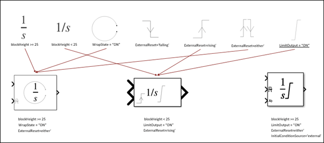
You can design complex block icons using icon parts and combine the parts based on parameter conditions. For example, refer to the Integrator_block block in the model slexMaskIconEditor. Each element in the icon of the Integrator_block block is designed as an individual part, and these parts are combined based on the visibility condition specified for each part. These conditions help to avoid a cluttered canvas.
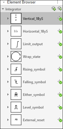
This image shows some of the Integrator_block icon variations based on visibility conditions. For example, the parts Vertical_1ByS and Either_symbol are combined to form an icon variation with the conditions blockHeight>=25, WrapState="ON", and ExternalReset="either".
Preview the variations of the icon on Simulink® canvas. The preview options Parameter Variations and Width Height Variations are available at the bottom of the Simulink canvas.
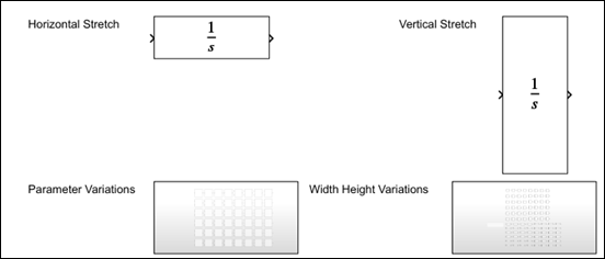
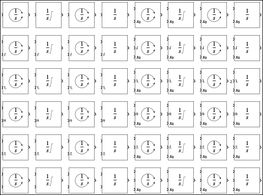
To view all the permutations of the integer block based on parameters and conditional visibility, click Parameter Variations and then Width Height Variations.
You can anchor block icon elements at a specific position or relative to other icon elements on the canvas using relative positioning. Relative positioning reduces manual adjustments when you resize or modify icons and help maintain consistent alignment and spacing.
Refer to the block Relative_position in the model slexMaskIconEditor.
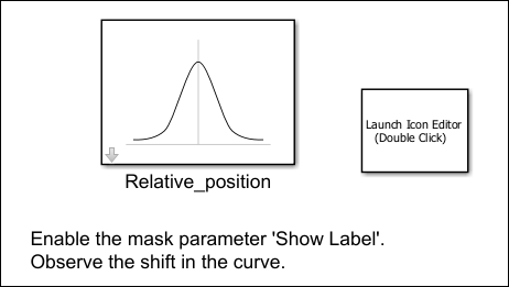
To position the elements on the block Relative_position:
1. Create a mask on the Subsystem block.
2. On the Parameters & Dialog tab, create a check box parameter named showLabel.
3. Click the Icon tab and design the icon.
You can group elements to manage multiple elements as a single unit, so you can move, resize, or modify them together. For example, you can group elements related to the Gaussian curve.
4. In the Element Browser pane, select the Gaussian element group. In the Element Properties pane, in the Relative Position section, click Edit Custom, and then set the appropriate condition for Vertical Center.
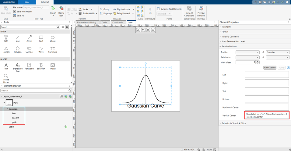
5. Save the icon and save the mask. Double-click the block Relative_position. In the mask dialog box, select Show Label, and observe that the text Gaussian Curve appears as a label on the block. The curve automatically adjusts its position to prevent any overlap with the label.
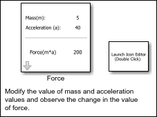
In a Simulink® block diagram, each block represents a component in the system. Instead of manually labeling the value on each block, you can use the Icon Editor to display the value of the parameter on the block itself to improve readability and reduce errors during model validation and debugging. When you bind a text element to a parameter, any change in the value of the parameter is reflected immediately on the block. You can also modify the value of a parameter on the block directly instead of modifying the parameter in the mask dialog box.
Refer to the block Force in the example model slexMaskIconEditor.
Parameterize Text
To parameterize text on the Force block icon:
1. Create a mask on the Subsystem block.
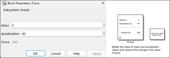
2. On the Parameters & Dialog tab, create three mask parameters: mass, acceleration, and force.
3. Write mask initialization and parameter callback code to calculate the force using the values of mass and acceleration.
4. Click the Icon tab. Design the icon using the text elements for labels mass, acceleration, and force. Place an Expression Text element next to each label for values.
Note: If you want to edit the value of the block parameter in the block icon itself, select Allow editing on block.
5. Follow the preceding steps to parameterize acceleration and force.
6. Save the mask.
Double-click the block Force, modify the values of mass and acceleration in the mask dialog box, and observe the results.
You can create a block icon that dynamically changes size when you resize the block. When you resize the block, the element that fits within the new size is displayed as the block icon. The image is neither shrunk nor cropped, instead a clear and readable version of the icon always appears, ensuring visibility and readability regardless of the size of the block.
Refer to the block First_fit in the model slexMaskIconEditor. Resize the block and observe the text displayed on the block icon. The biggest size contains the matrix values and the smallest size contains the index K of the matrix.
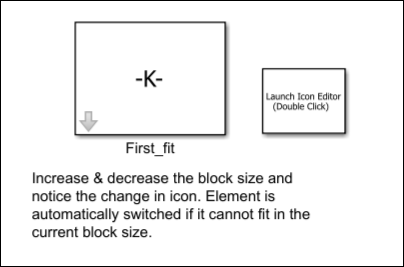
To design icon similar to the block Layout_Constraints follow these steps:
1. Create a mask on the Subsystem block.
2. Click the Icon tab, in the icon canvas, insert the equation tool and specify the LaTeX equation \pmatrix{0 & 1 & 2 & 3 \cr 4 & 5 & 6 & 7 \cr 8 & 9 & 0 & 1} and \pmatrix{3 \times 4} to display the values and dimension of the matrix respectively. Create a text element K to display the index of the matrix.
3. Select all the three elements, right-click and select Convert to First Fit.
This groups the selected elements and only the elements that fit the icon size are displayed.
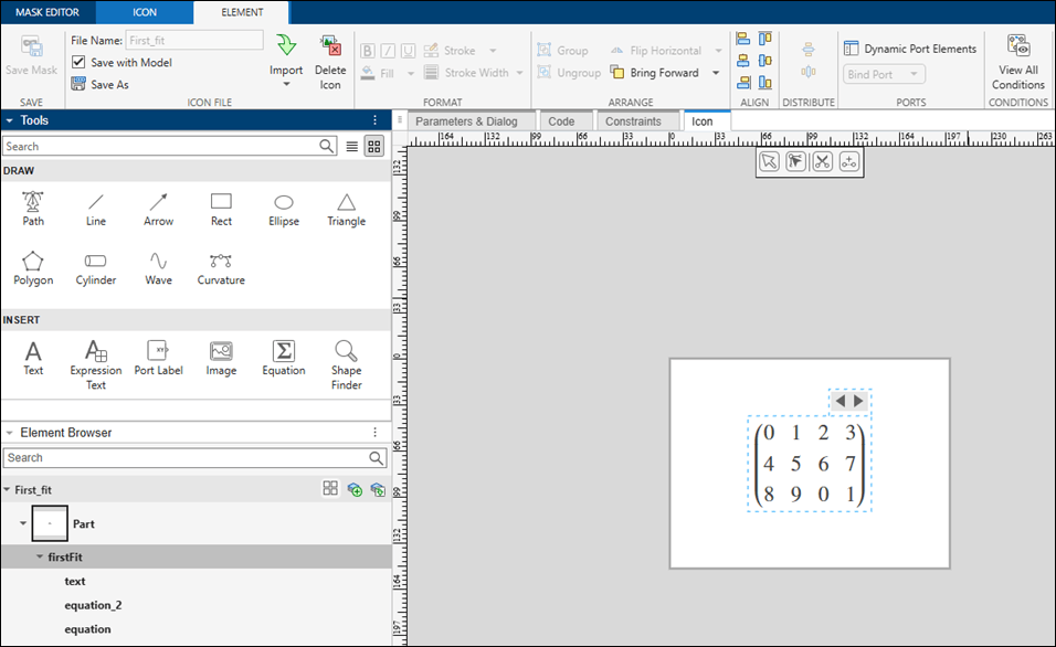
4. Save the icon and save the mask.
Resize the block and observe the text displayed on the block icon.
You can automatically repeat elements across multiple ports in a masked block icon without having to manually repeat the element at each port, which avoids clutter on the canvas. In the example model slexMaskGraphicalIconEditor.slx, refer to the block Auto_repeat, where the circle element repeats on each port on the left side of the block, and the rectangle element repeats on each port of the right side of the block.
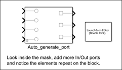
To repeat the icon element across multiple ports:
1. Create a mask on the block.
2. Click the Icon tab.
3. Create a rectangle element to the right of the canvas.
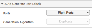
4. Select the rectangle element. To repeat the element on the right pane, in the Element Properties pane, under Dynamic Port Elements, select Right Ports.
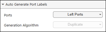
Repeat the circle element on the left ports. In the Element Properties pane, under Dynamic Port Elements, select Left Ports.
Look inside the Auto_Repeat Subsystem block. Add one or more In or Out ports and observe the changes.
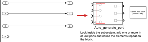
You can automatically increment a text element that is bound to a port. For example, if you bind a text element labeled a to a left port and want the text to increment automatically across other left ports, set Generation Algorithm to Increment. The labels for the other left ports will appear as a1, a2, and so on.
You can use the Icon Editor to create block icons for Simscape® blocks.
1. Open the model slexMaskGraphicalIconEditor_simscape.
open_system("slexMaskGraphicalIconEditor_simscape");
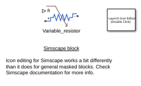
2. To launch the Icon Editor double-click Launch Icon Editor block or use this command in the MATLAB Command Window:
Simulink.IconEditor.open(gcb);
3. For more information on using the Icon Editor to view and edit block icons for Simscape blocks, see Using the Icon Editor in Customizing the Block Name and Appearance (Simscape).
Parameters
Version History
Introduced in R2022b

