Advanced Visualization with Serial Link Designer
This example shows you how to utilize the advanced visualization techniques using the Signal Integrity Viewer app. You can get deeper insight into the design and visually identify the trends (trends plot) and/or outliers (scatter plot). For more information about the techniques used here, see Managing Simulation Data and Results and Advanced Visualization Using Signal Integrity Viewer.
Example Project
Open the example project in the Serial Link Designer app.
openSignalIntegrityKit('sldAdvancedVisualization')
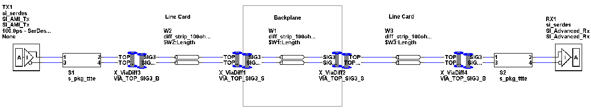
The project consists of a single schematic sheet containing a channel which consists of a backplane with two line cards attached. The solution space is set up to sweep line card length from 1 to 3 inches and backplane length from 10 to 15 inches. The lossy transmission line is varied over process (+/- 10% impedance) and delay (FE, SE, and TE). The solution space uses a variation group named len for the transmission line length variable on each line card to lock both values to sweep together reducing the simulation count from 9 to 3. For more information on variation groups and other solution space functions, see Solution Space.
The receiver has equalization capabilities in the form of a DFE and a CTLE. The number of DFE taps varies from 3 to 6. This example simulates the channel with no equalization, DFE only, CTLE only, and with DFE and CTLE.
The simulations cover all IC corners for process, voltage and temperature variations (fast (FF), slow (SS), and typical (TT)). There are a total of 864 simulations set up in the project. The example only uses the results from statistical analysis. You can also simulate the project in the time domain as well. However, time domain simulations requires significantly longer simulation time and are not necessary for this example.
Run the simulation.
Plots Mode
To visualize the simulation results in the Plots mode, click the Plots tab.
When in Plots mode, the left side of the window contains the various tabs which correspond to the Channel Analysis Report results. You must select the correct tab corresponding to the specific analysis you are interested in. For this example, choose the Statistical tab.
Plots mode gives you the control of both the x- and y-axes to plot any results or variables used in the simulation. On the right-hand side of the Signal Integrity Viewer window is a list of the variables that correspond to the y-axis. There is also a wildcard filter at the top of the dialog to easily find the desired result or variable for plotting.
To set up the x-axis, click the gear icon at the top of the first column (Row) in the results table. This opens the Table Column Control dialog box where you can choose the x-axis results and variables for a given plot.
After defining the axes, you can do scatter plots or trend plots.
Scatter Plotting
The scatter plot helps you understand how each of the equalization options affects the statistical eye height and width. They are grouped by color. Red is where no equalization is applied to the design. Blue is where the CTLE, or peaking filter is used. Green is for the DFE only and brown is for both DFE and CTLE together. A horizontal marker at 100mV shows the eye height limit for the design. Results that fall below the marker would be considered failing cases.
To create this plot:
Select the Plots tab in the Signal Integrity Viewer.
Select the Statistical tab at the left side of the window.
Select the gear icon in the column header for Row.
Right click in the highlighted checkbox area and
Set All Invisible.Select the checkboxes for each of the columns shown below along with selecting Stat Eye Width in the X-axis pull-down menu. Then select
OK.In the Stat ARX1.peaking_filter.mode and Stat ARX1.dfe.mode columns set them both to
offas shown.Select all of the filtered results in the table.
Select Stat Eye Height and click the Add button. This plots up as a red scatter plot for the case with no equalization.
Follow the same process but change the filter by setting Stat ARX1.peaking_filter.mode to
autoand plot those results. This adds the blue scatter plot.Now set Stat ARX1.peaking_filter.mode to
offand Stat ARX1.dfe.mode toautoand plot the results. This adds the green scatter plot.Lastly set both Stat ARX1.peaking_filter.mode and Stat ARX1.dfe.mode to
autoand plot the results. This adds the brown scatter plot.Now add a horizontal line to mark the
100mVeye height requirement. Below shows how to access the horizontal marker icon. Place down the marker with a left click. Then right click with the marker selected and select edit value. Change the current value to100mV.
This plot shows that without equalization there are no cases that pass the eye height requirement. As you kepp on adding equalization techniques, the number of passing cases increases.
To insvestigate how adding DFE taps affects the results:
Add a new display.
In the column sort, set Stat ARX1.peaking_filter.mode to
offand Stat ARX1.dfe.mode toautoand Stat ARX1.dfe.number_rx_tap to3.Plot the results as before.
Repeat the process by setting Stat ARX1.dfe.number_rx_tap to
4,5and6.
The plot shows that 6 DFE taps provides the best equalization for this channel. However there is still one case that fails to meet the 100mV eye height.
Enable the CTLE with the DFE and plot the Stat_Eye_Height vs. $W1:LENGTH (length of the backplane) plot.
Set the X-axis in the Table Column Control to
$W1:LENGTH.In the column sort, set Stat ARX1.peaking_filter.mode and Stat ARX1.dfe.mode to
autoand Stat ARX1.dfe.number_rx_tap to 3. Then select StatEyeHeight(V) and add to the plot.Repeat the process by setting Stat ARX1.dfe.number_rx_tap to
4,5and6.Add a horizontal marker at 100mV as before.
This offers a different look at the data which shows how the eye height changes over the length of the backplane with different numbers of DFE taps. For backplane lengths up to 12 inches only 3-taps would be required. However as backplane length is increased to 15 inches, only the 5-taps and 6-tap cases meet the eye height requirement.
Trend Plotting
To create a trend plot, you need to sort the data by a unique variable. Then you can click the Add Trend button in the Signal Integrity Viewer.
A trend plot to show the effect on statistical eye height Vs. backplane length Vs. corner process with DFE set to 3-Taps is shown:
The X-axis is the backplane length, Y-axis is eye height and red, green and blue trend plots correspond to process corners FFFE, TTTE and SSSE respectively.
To create this trend plot:
Set the column sort boxes to Stat ARX1.peaking_filter.mode=off, Stat ARX1.dfe_number_rx_tap=3, Stat ARX1.dfe.mode, and $W2:LENGTH=3
Click on the header of the CORNER column to sort the data, either ascending or descending. Note: The colors of the plots will change depending on ascending or descending but the trends will be the same.
Select all results.
Select StatEyeHeight(V) and press the Add Trend button.
The red will be the FFFE corner, Green is the TTTE corner and blue is the SSSE corner.
The plot shows that the eye height generally goes down over backplane length, however two of the cases shows something different. The FFFE corner (red plot) and the SSSE corner (blue plot) show the eye height at a backplane length of 12 inches is slightly higher than that at a length of 11-inches. This might seem counter-intuitive, but it is entirely possible that there is a resonance in the channel at the backplane length of 12 inches. To definitively know would require further investigation of the design.