Visualizing Four-Dimensional Data
This example shows several techniques to visualize four dimensional (4-D) data in MATLAB®.
Visualize 4-D Data with One Discrete Variable
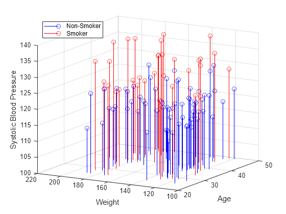
Sometimes data has a variable which is discrete with only a few possible values. You can create multiple plots of the same type for data in each discrete group. For example, use the stem3 function to see the relationship between three variables where the fourth variable divides the population into discrete groups.
load patients Smoker Age Weight Systolic                           % load data

nsIdx = Smoker == 0;
smIdx = Smoker == 1;

figure
stem3(Age(nsIdx), Weight(nsIdx), Systolic(nsIdx), 'Color', 'b')    % stem plot for non-smokers
hold on
stem3(Age(smIdx), Weight(smIdx), Systolic(smIdx), 'Color', 'r')    % stem plot for smokers
hold off

view(-60,15)
zlim([100 140])

xlabel('Age')                                                      % add labels and a legend
ylabel('Weight')
zlabel('Systolic Blood Pressure')
legend('Non-Smoker', 'Smoker', 'Location', 'NorthWest')
Visualize 4-D Data with Multiple Plots
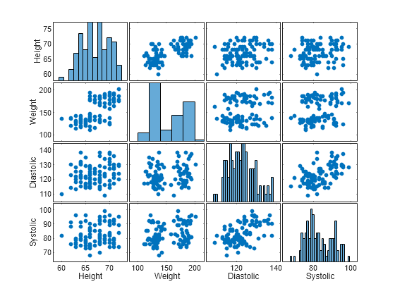
With a large data set you might want to see if individual variables are correlated. You can use the plotmatrix function to create an n by n matrix of plots to see the pair-wise relationships between the variables. The plotmatrix function returns two outputs. The first output is a matrix of the line objects used in the scatter plots. The second is a matrix of the axes objects that are created.
The plotmatrix function can also be used for higher order data sets.
load patients Height Weight Diastolic Systolic    % load data

labels = {'Height' 'Weight' 'Diastolic' 'Systolic'};
data = [Height Weight Systolic Diastolic];

[h,ax] = plotmatrix(data);                        % create a 4 x 4 matrix of plots
for i = 1:4                                       % label the plots
  xlabel(ax(4,i), labels{i})
  ylabel(ax(i,1), labels{i})
end
Visualize Function of Three Variables
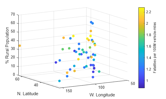
For many kinds of four dimensional data, you can use color to represent the fourth dimension. This works well if you have a function of three variables.
For example, represent highway deaths in the United States as a function of longitude, latitude, and if the location is rural or urban. The x, y, and z values in the plot represent these three variables. The color represents the number of highway deaths.
cla
load accidents hwydata                             % load data

long = -hwydata(:,2);                              % longitude data
lat = hwydata(:,3);                                % latitude data
rural = 100 - hwydata(:,17);                       % percent rural data
fatalities = hwydata(:,11);                        % fatalities data

scatter3(long,lat,rural,40,fatalities,'filled')    % draw the scatter plot
ax = gca;
ax.XDir = 'reverse';
view(-31,14)
xlabel('W. Longitude')
ylabel('N. Latitude')
zlabel('% Rural Population')

cb = colorbar;                                     % create and label the colorbar
cb.Label.String = 'Fatalities per 100M vehicle-miles';
Visualize Data in a Volume
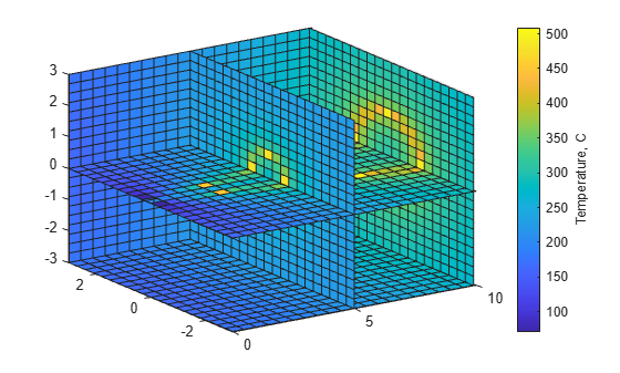
Your data may contain a measured value for a physical object such as temperature in a pipe. In this cases, the physical dimensions can be represented as a volume with color used to represent the magnitude of the measurement. For example, use the slice function to show the value of the measured variable at cross-sections within the volume.
load fluidtemp x y z temp                       % load data

xslice = [5 9.9];                               % define the cross sections to view
yslice = 3;
zslice = ([-3 0]);

slice(x, y, z, temp, xslice, yslice, zslice)    % display the slices
ylim([-3 3])
view(-34,24)

cb = colorbar;                                  % create and label the colorbar
cb.Label.String = 'Temperature, C';
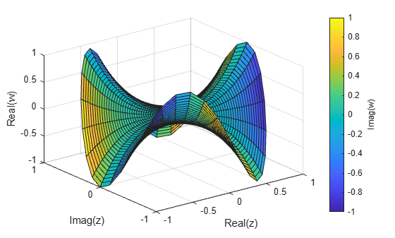
Plot the Function of a Complex Variable
A complex function has an input with real and imaginary parts and an output with real and imaginary parts. You can use a three dimensional plot with color to represent the complex function. In this case the x and y axes represent the real and imaginary parts of the input. The z axis represents the real part of the output and the color represents the imaginary part of the output.
r = (0:0.025:1)';                        % create a matrix of complex inputs
theta = pi*(-1:0.05:1);
z = r*exp(1i*theta);
w = z.^3;                                % calculate the complex outputs

surf(real(z),imag(z),real(w),imag(w))    % visualize the complex function using surf
xlabel('Real(z)')
ylabel('Imag(z)')
zlabel('Real(w)')
cb = colorbar;
cb.Label.String = 'Imag(w)';
You can also select a web site from the following list:
Americas
- América Latina (Español)
- Canada (English)
- United States (English)
Europe
- Belgium (English)
- Denmark (English)
- Deutschland (Deutsch)
- España (Español)
- Finland (English)
- France (Français)
- Ireland (English)
- Italia (Italiano)
- Luxembourg (English)
- Netherlands (English)
- Norway (English)
- Österreich (Deutsch)
- Portugal (English)
- Sweden (English)
- Switzerland
- United Kingdom (English)